Spark Reading Kindergarten to Grade 6 Little Books


Company:
Pearson Education Canada (Spark Reading)
Application:
Web Application
Main Platform:
iPad Tablet, Android Tablet
Tools Used:
Lucid Chart, Adobe XD, Balsamiq, Xtensio, Figma, Pen & Paper
My Role:
User Interface Design, Quality Assurance Tester, Wireframing, User Experience Design, Data Collection from Usability Testing, Persona Creation
Target Audience:
Kindergarten, Grade 1 - 6, Youth Education
Who I Worked With:
Book Editors, Web Developers, Teachers, Researchers
Project Time:
Estimated for 1 - 2 years. Still ongoing.
Spark Reading little books are a bunch of physical books that are on average 8 – 12 pages created for children that start at kindergarten all the way to grade 6. Each of these books aiming for the younger grades have topics relating to animals, food, plants, weather, …etc. General things that are around us for kids to learn about the world and what is around them. For the older grades, topics can be more personal or mature such as school problems, social topics or friends. The end goal of all these books are to help them improve their overall reading abilities either with the physical book copies or using this online eBook learning tool.
“The end goal of all these books are to help them improve their overall reading abilities either with the physical book copies or using this online eBook learning tool.”
The organization Pearson Education had 1000+ physical children books that needs to be converted to digital format (eBooks) because majority of the audience are now going digtial rather than possessing physical copies. Along with the digital formatting, they also need digital assets associated with these books such as the ability for users to answer questions on what they have read, doing activities, voice recording and a closing product. The closing product is targeted for younger audiences by rewarding them in some way or format which is repeatable for their continuous participation in reading. While the organization wanted all these features, they also had a major road block such as a limited budget. This limited budget also affects a very important factor whether to go for fixed layouts (HTML pages that have a fixed design structure) of these books or complete redesign for responsive uses (mobile friendly) on various viewing devices.
This project case study is split into 4 different parts:
eBook
eBook Activity
Recording Feature
Reward System
There are a couple of goals that need to be achieved throughout this entire project because there are many different components. They are redesign of the eBooks for responsive devices, create engaging user interfaces for questionaires within the activities and another user interface for voice recording. Lastly for the the reward system, it is to come up with some sort of a product that has repeatable usage and longevity. This product for younger students should share similar characteristics with their other entertainment products. Examples of characteristics are retain its fun nature and maintain constantly interesting to keep them login for long periods of time. All in all, the organization want this reward system to have all these all these attributes found within other products without turning the reward system into an actual game itself.
These 4 components of this project are a product by itself that requires individual way of thinking in coming up with solutions. The only data that can be used which also spans across these products is the information collected from the physical books itself being read. The books itself were tested by some of the family members to get a general information of data (eg: did they like reading it? Will they read it again? …etc) and feedback on the effectiveness of the product. This information collected is very valuable because the organization potentially can use them in the future in creating digital format versions. This data is also used to foretell if is a good idea in the continuation on extending this product’s lifespan.
How did I go about in solving this problem?
Due to this whole project being limited to a fixed budget, it was quite a challenge in deciding whether to go for a fixed static design format or a responsive design format for these eBooks. Just a general decision on which of the two to choose was not going to be the best approach because as of this time that this project has started, responsive design was practically systematic in most web pages out in the world wide web. So therefore, the organization had to think of a strategy to decide which of the two to take.
In order to decide which method to take. The process of time risk management was used to factor in that final decision. The organization gave me a chance to see what I can do and multiple that by a 1000 times to find an estimate in cost and time. The reason we went with this method was because there were couple of issues on this specific eBook creation. The first issue was that there are 1000+ books and we had to ask ourselves, is it worth the time and effort to “redesign” all 1000+ books responsively with limited manpower? A lot of these books transitioning to eBooks will require wireframing from me from beginning to end. For each iteration of wireframing to get to the final design, many back and forth consultation is required between the art director and me on the right design to take for these eBooks. There will also be days when a stakeholder also wants to make a decision on how the design should look for certain eBooks because there are some components that are very important and should be the focal point of that page. In the end, these decisions over a long run will cause a big ripple in the duration of the project.
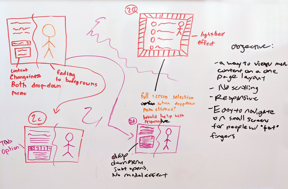
One of many design meetings on what to approach between the art director, project director and me for the design. Many key components need to be the focal point on certain pages thus the design will need to be change once again. These changes can be a big or small, however over a long run especially if there are 1000+ books that need to be change, this is not an ideal solution and will lead to over budget.
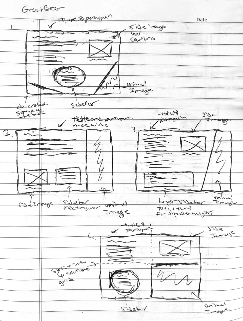
Pen and paper sketches for the book Great Bear Rainforest to show a low fidelity wireframe iteration for approval from the art director. This is only one sketch for one eBook. This method will be required for each one that I am planning to design.
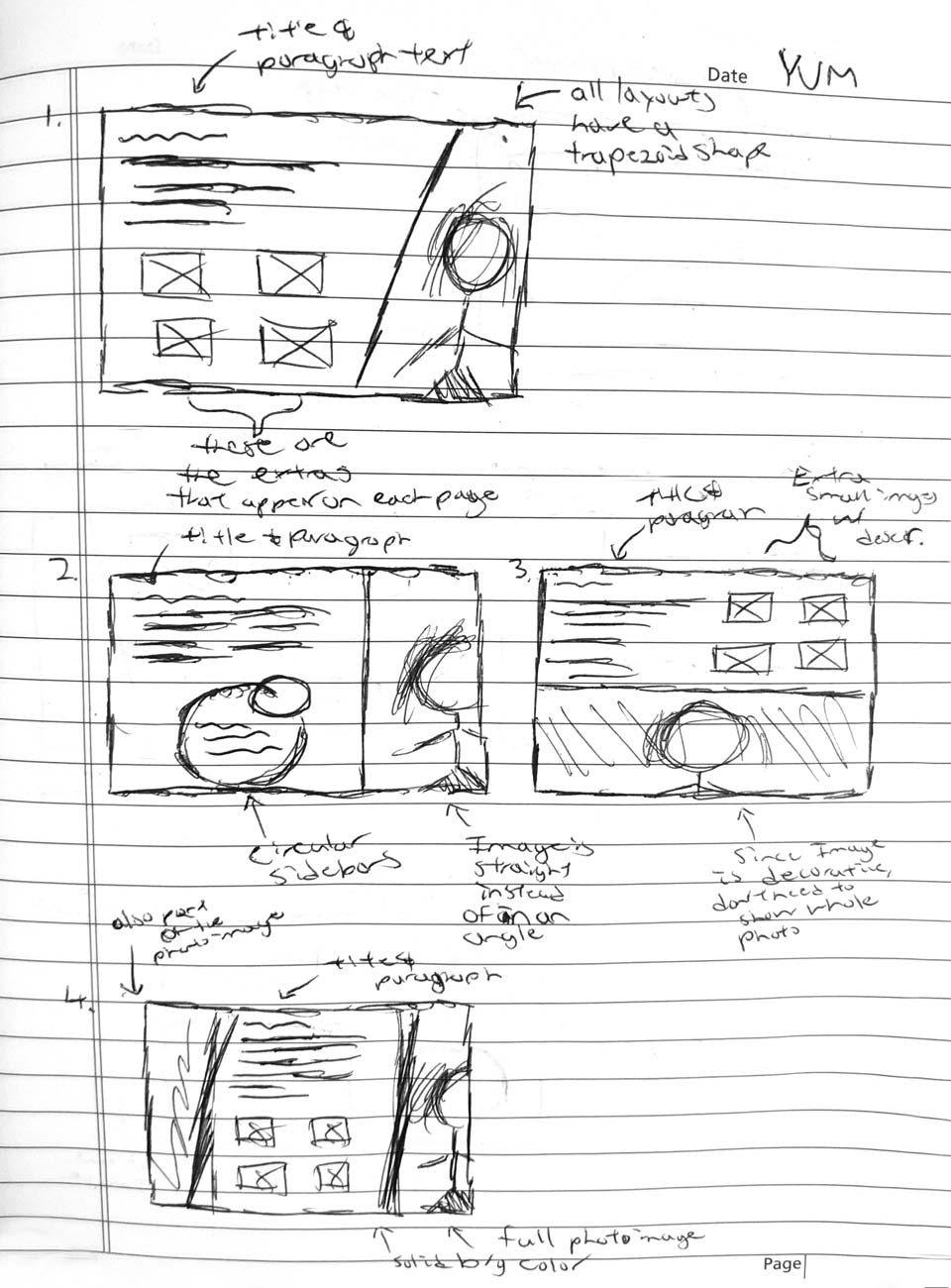
Another pen and paper sketches this time for the book YUM. As previously stated above, continuously creating a new sketch every time is very time-consuming and not efficient in a long run for the designer. This will eventually lead to a not so well-designed eBooks for stakeholders as well.
Second factor we had to considered was that some book layouts look the same because they are from the same series created from the same author. While a similar design can be accomplished for those set of books, a lot of them are also standalone and require specific attention for a new design every time. Lastly, the third issue is that the organization was planning to outsource a lot of the work to "speed" up the process. While on paper, outsourcing does sound like it speeds up the process, however their thinking and the organization’s thinking do not always align the same and this can potentially create conflicts.
Although the third issue was out of my control and my stake in it was minimal, my job was to research current trends and other competitors. Using what I acquired through researching, I would then use one of the books as an example and redesign this book in a complete responsive process while managing how long it takes. While researching, I also have to consider the web content accessibility guidelines (WCAG) for different types of impaired users and if it works for web development because while I can design anything, it actually has to be possible to create it with coding without breaking W3C validation and accessibility. After the first one was completed I went onwards to create 2 or 3 more designs which helps answers the second factor. It gives the organization answers for the average time it takes to come up with designs for mobile responsiveness for a set of books.
“... to get to the final design, many back and forth consultation is required between the art director and me on the right design to take for these eBooks.”
What steps I have used to overcome the problem?
Research, cumulative discussions, pen and paper sketches, using Lucid Chart for low fidelity wireframes and high fidelity prototypes were used in achieving the outcome solution of this problem. Research was needed in order to see current trend designs that can be implemented into the current design (eg: flat design, minimalism / white spacing).
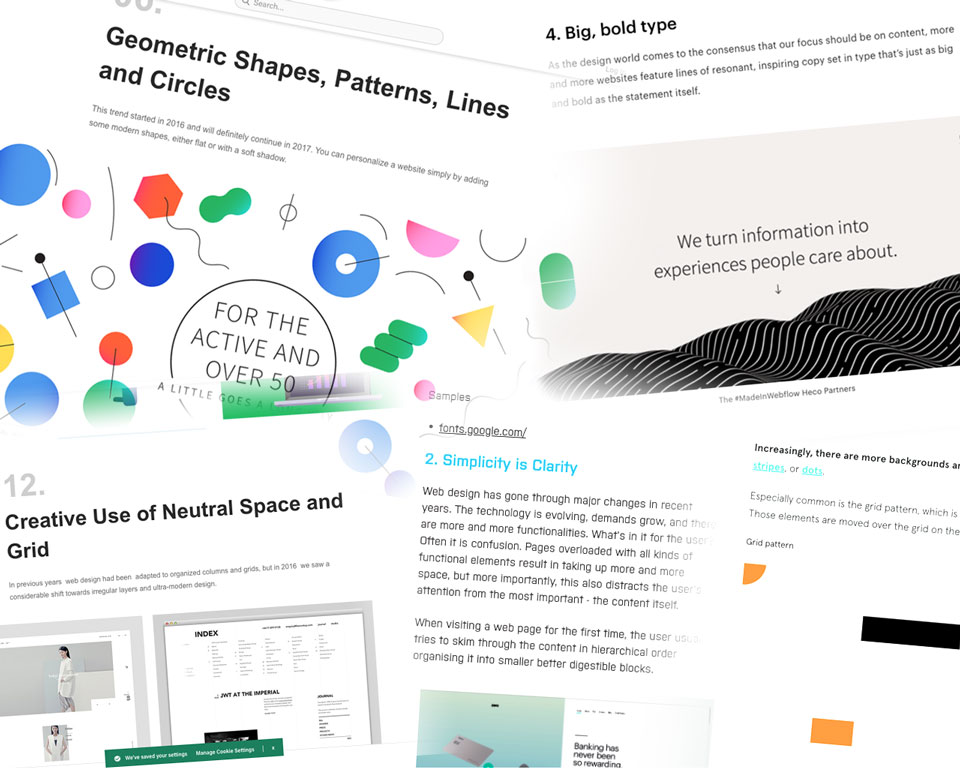
Researching design trends in 2017 on Google. A lot of the designs are still being used today in 2020 and 2021. When compare to today's design to 2017 not much has changed. Such examples are, users on the web still enjoy big text, seeing a lot white spaces and vector drawings of shapes or animations.
The cumulative discussions, pen and paper sketches and low fidelity wireframes on Lucid chart all go together. I would first create the quick design mockup and present it to the art director and/or stakeholders for feedback. Once I have a general sense on what they prefer and how a design should look, it is then that I would move on to high fidelity mockups.
In order to create the high fidelity mockups to foretell the potential of how the final product will look, I would design these eBook views on Adobe XD. During this step, there will still be back and forth on design changes however it will not be as many as it was in the low fidelity wireframes.
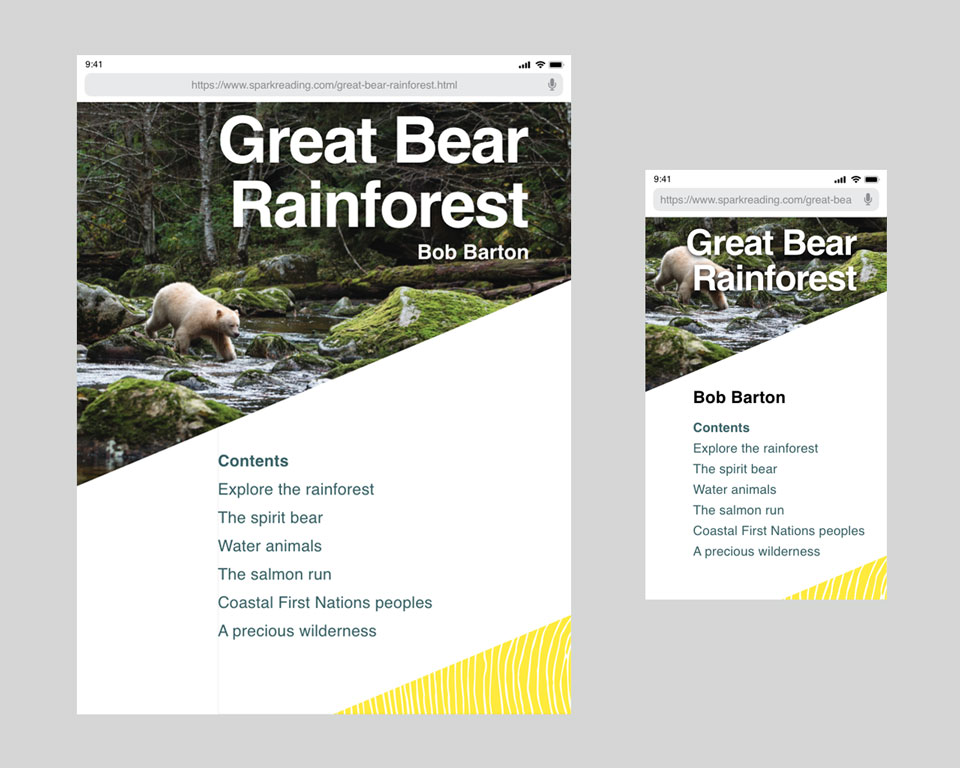
Adobe XD high fidelity prototypes to showcase the main tablet design and also the potential look of the desktop or mobile views. Above is an eBook design that belongs to a book series. This allows me design a layout where I can use this same structure throughout the entire series , with minor changes and only required to swap the images out.
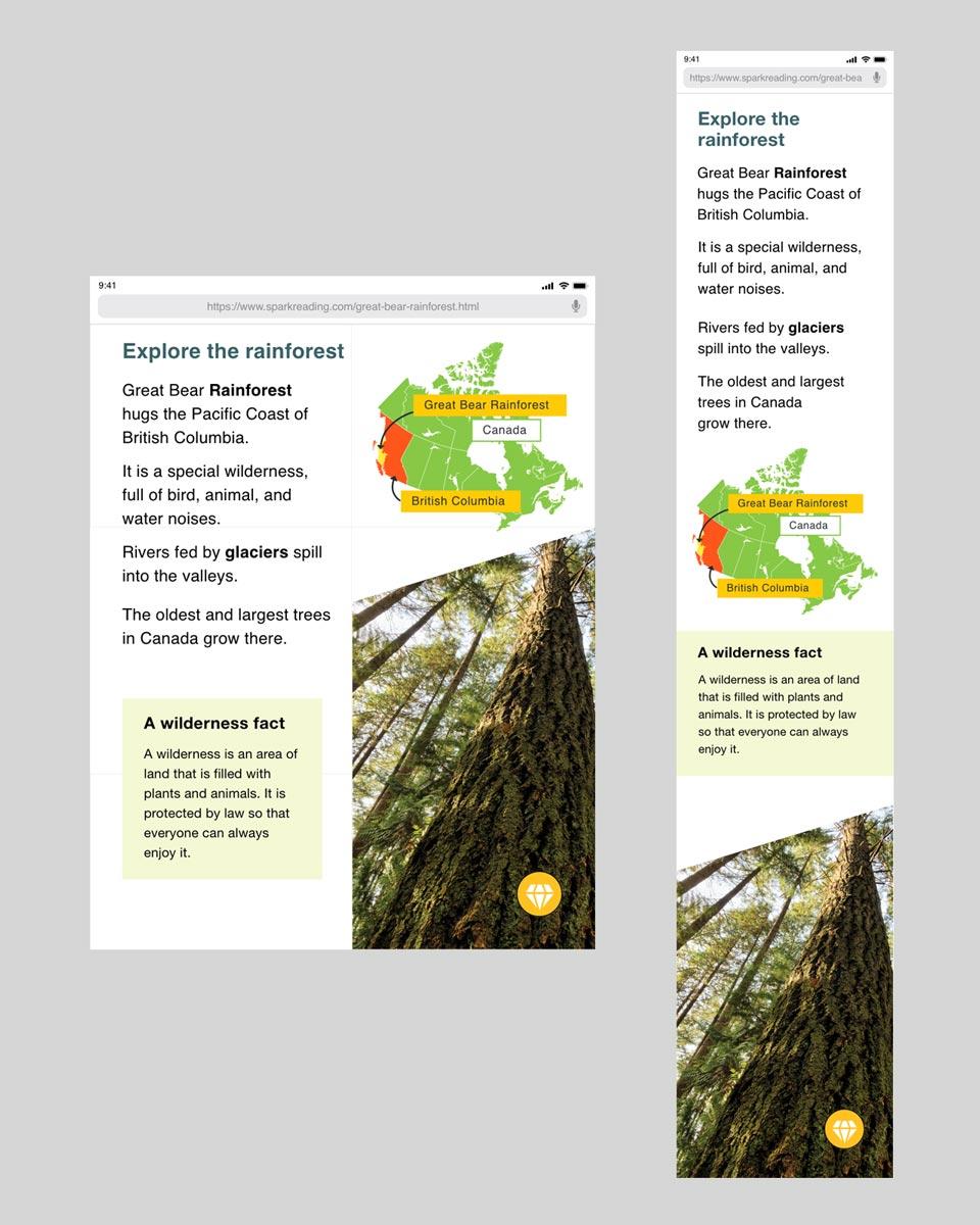
I have design this eBook like a grid system, so on the smallest device such as a phone, this eBook can still give a proper user experience when the content are stacking on top of each other. This stacking will then allow the user to navigate throughout the page much simpler and clear.
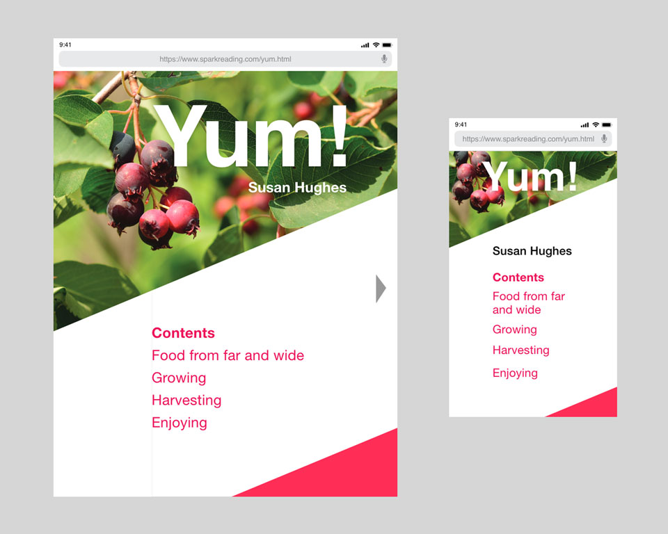
The book YUM comes from the same series as Great Bear Rainforest (even though it's a different author). Therefore to speed up the design, the layout looks very identical. Above is the table of contents that looks almost the same as Great Bear Rainforest.
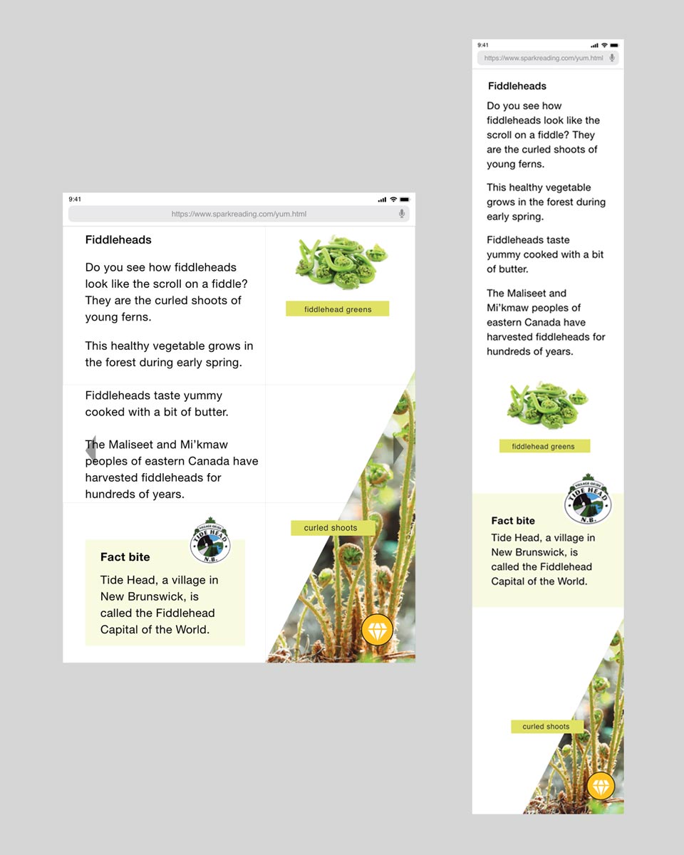
The sub pages also almost look identical between the 2 eBooks. There are only a slight deviation between the two such as a different shape for the attention getter imagery. However the overall layout is still in a grid structure when looking at it closely.
What I learned and what I go out of this?
Due to time management and the requirement of 1000+ books that need to be produced, a fixed layout was chosen as the final decision. The organization's stakeholders chose this outcome because redesigning for responsiveness requires a lot more time and people to manage. The designs will always need to be constantly looked at and approved whereas in a fixed layout which has a similar look as the original book, the design is already approved when the books got printed. Since those original designs are already final and require minimal to no changes at all, these fixed layouts allowed the organization to outsource to third parties right away thus making the process a much smoother pace. Seeing that the organization chose to use third party vendors, the vendors just need to follow the design already presented in the physical books and this method eliminates the need for them to redesign anything and in a way saving costs and time in the end.
In conclusion, what I learned from the organization choosing to use third party vendors instead of internal resources is that the final product is not always what you produced. Stakeholders are required see the bigger picture which can eclipse a design process that is even well-thought-out. The number one important rule for stakeholders is prioritizing any projects within the budget because they are the ones paying to have this product created.
How did I go about in solving this problem?
My approach in solving and coming up with a solution for interactive activities is like any other project that I have done which is to research on current products that are currently working. After some extensive exploring, I have narrowed it down to these popular products that are currently hot in the market. These interactive activities come from Prodigy Math, Didax Math and Raz Kids. What I wanted to take away from these sites is the understanding of what younger kids like to do on these activities and the commonality between these 3 websites. In addition to my research, I have also leisurely observed my niece on her tablet on the activities she is playing with and why it it enjoyable for her. Furthermore, unrelated in functionality to this eBook activity, I had ed her playing on the Nintendo Switch on the games she spends a lot of time on. For me as a takeaway of her playing on the Switch, it was to get a general idea how the user interface looks and the user experience that comes from those games.
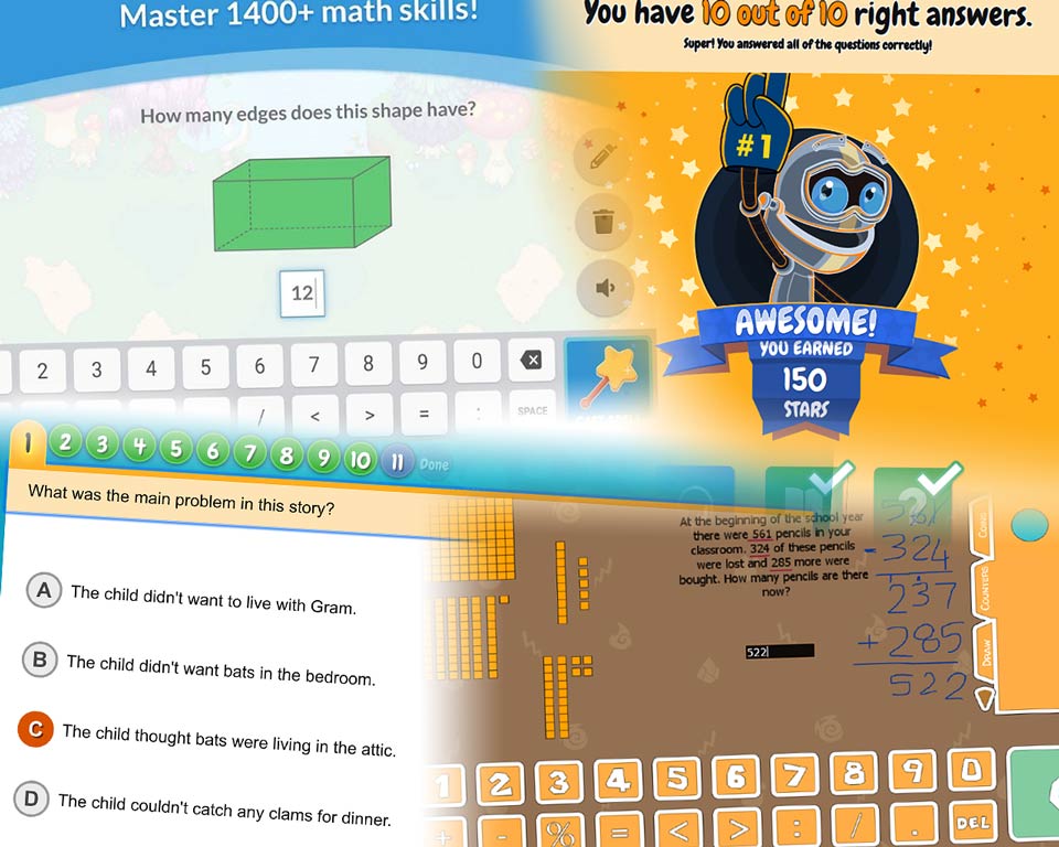
Researching how Raz Kids and Prodigy Math design plus functionality behaves to get the feel of the website application.
The colour scheme and typeface choice were also very important in designing for this age group. In all 3 of those websites, something that I found in common throughout the research was younger kids prefer brighter colours. These special type of colours have warmer and friendlier attributes as opposed to monochromatic which are preferred by adults. Typeface for kids are more rounded that gives a "soft feeling" compare to basic typefaces like Times New Roman serif fonts that are more prone for adult readers. Since these attributes will be integrated as part of the eBook activities, all the colours, font choices, font sizes and functionality have to follow proper W3C accessibility standards.
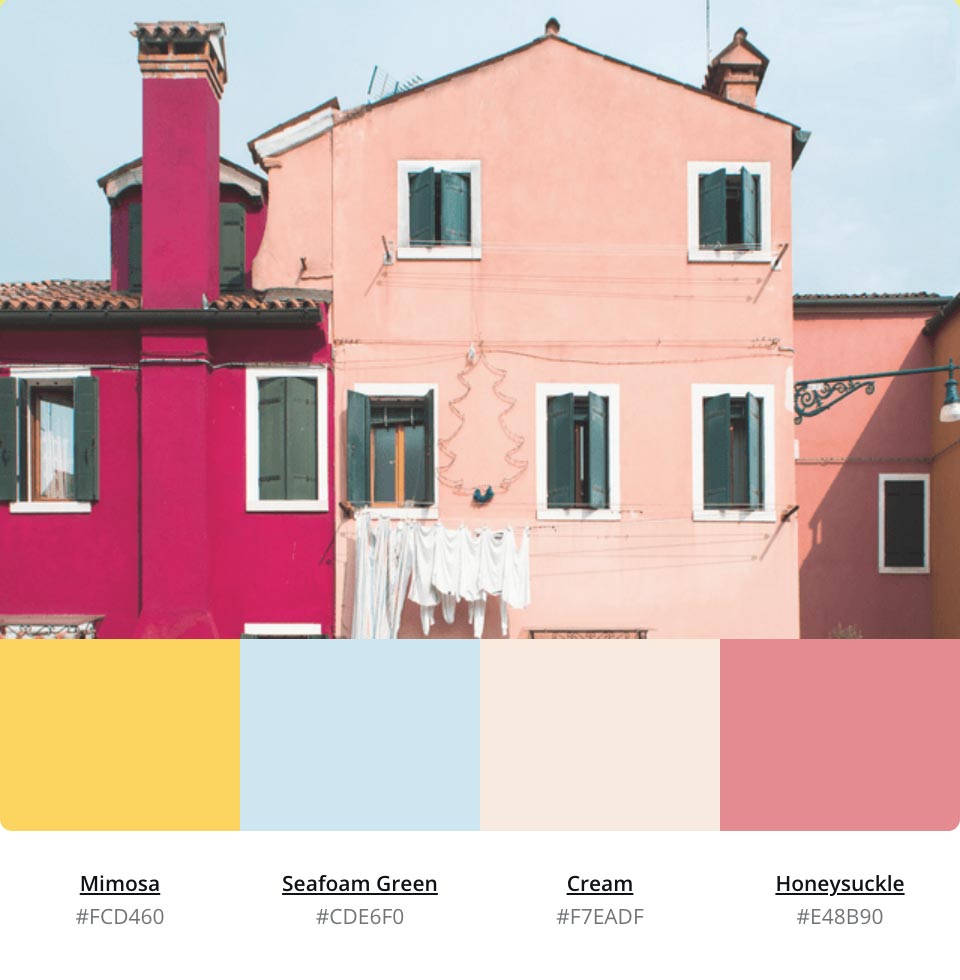
Trying to find colour combinations that work together while keeping it in the warmer side. At first I was going for the fundamentals of warmth that consists of yellow, orange and red. Nonetheless, those colours might be too vibrant. So in the end, I picked a sky colour because it looks cheerful like a bright sunny day.
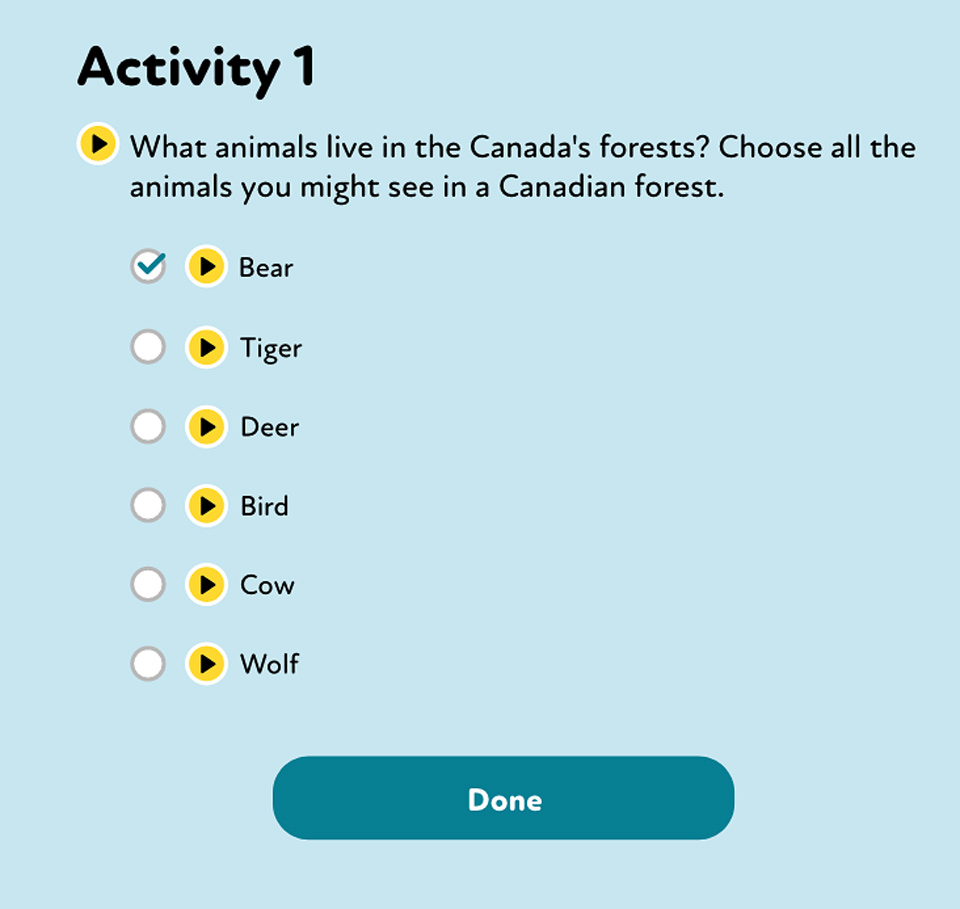
This is one of many accessibility features implemented in this eBook activity. Above image shows audio play buttons that uses text-to-speech (TTS) technology to read aloud the question and each of the answers for people that might be visually impaired.
What steps I have used to overcome the problem?
Research, low fidelity wireframes and high fidelity prototypes were key in achieving the outcome of this problem. Research from existing and competing products were used to find colour combinations that can presumably go well together. This method also helped me find proper uses of fonts that is appropriate for the younger age group. Low fidelity wireframes has always been the bread and butter for any startup to get a quick design and collect feedback. The high fidelity prototypes were produced to display the designs on different viewing devices and presenting them to stakeholders.
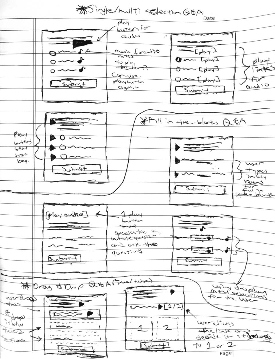
Pen and paper sketches to show preliminary designs for approval.
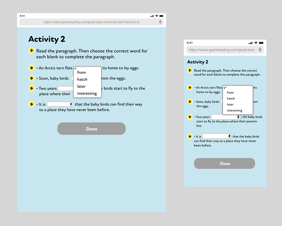
Fill in the blank questionnaire with selectable options to help children learn instead of "punishing" them for the correct answers before they can move on.
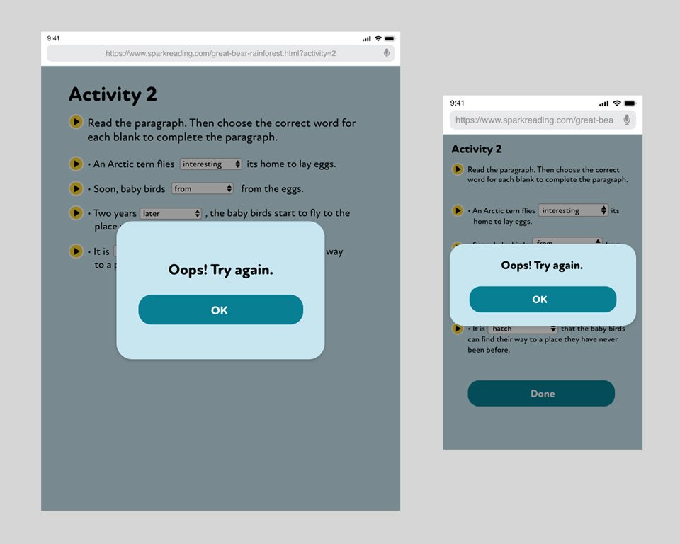
Proper user feedback message when something is incorrect. Rather than berate the user of their failure, I wanted to create something that is still friendly, okay to make mistakes and then try again.
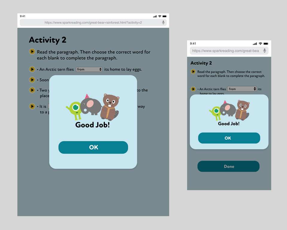
A successful feedback when the user answers the questionnaire correctly. In order to make the message really stand out instead of just plain text saying it was successful, I have added some imagery to liven up the mood of the user for a job well done.
What I learned and what I go out of this?
In the end, the designs that I have introduced and presented as high fidelity prototypes were used as the eBook activity application. Full screen interactive activities were implemented throughout each individual eBooks from the 1000+ books. As of right now the ones that are completed are currently being used by younger kids. From the latest feedback collected, there were not many user experience issues because some of the features are commonly used in other kids websites and mobile apps which they are all familiar with already. Second is that I followed the accessibility guidelines as good as possible to produce a well-designed user interface, preventing bad experiences when the user navigates throughout the activity.
The font size and typeface I have chosen were very important overall because just the typography itself can make or break the intended purpose of the product. At first, I wanted to use typefaces that were much more rectangular (sans-serif) because it is clean and easy to see. Although that look clean, it did not work for younger kids since it looked more like it was intended for commerce. In the end, it was a good decision to make that change to use a much more rounded font because it was effective to give it a softer look that matches what kids like to see on current successful products.
How did I go about in solving this problem?
The issues with recording programs or applications is that there are so many out there already and are working as intended. In order to come up with the design and functionality for the recording feature that works well with this Spark Reading project, I had to look for products that are out there that are targeted only to children. These products range from general voice recordings web applications to physical recording toys. During my research for mobile/web recording apps and toys, I notice a similar pattern that spreads across all these products. The pattern I noticed was that both toys and recording applications targeted at children have big recording buttons and little need of customization on recording. When compared with general recording applications, the user can customize the decibels and remove background noises just to name a few. I believed these features are unnecessary for this age group and might be too complicated for the intended users. So for the recording feauture, I chose to cut off all those extras and just have a basic record and stop functionality only.
In addition to the recording itself, there are also other preliminary screens before that. For those before screens, I want to keep the same simplicity which is to eliminate all the extras and have straight clear cut instructions for them to do what they need to do and then move on.
“I believed these features are unnecessary for this age group and might be too complicated for the intended users.”
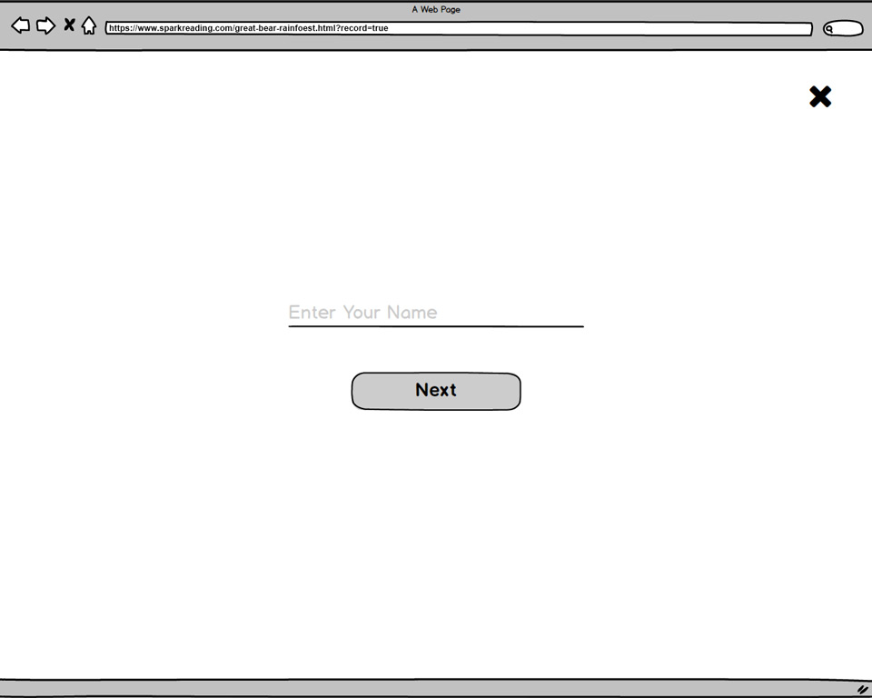
Low fidelity prototype created in Balsamiq to showcase the least amount of steps before the user can start recording. In the image above, the user just has to enter their name before it goes straight to the recording feature. The only reason the user has to enter their name is because when a recording is done, the sound files need to be unique from the previous user, since this is a shared login web application.
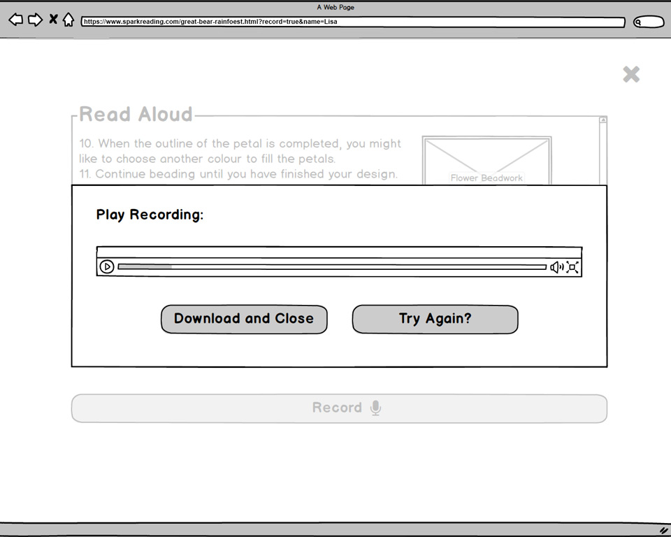
Reducing the number of options required for the user when a recording is done. The image above shows only 3 options. Listen to what was just recorded, download and close this recording feature or try to rerecord again. The download and close functionality is also shorten to one step because the user already entered their name previously. This allows them to not required to think very much and they can just move right on.
What steps I have used to overcome the problem?
Research was used first, a mockup with low fidelity wireframing was next and to finish it off with a high fidelity prototype on Figma. Research was used to discover the reason to eliminate unnecessary features and reduce the number of clicks required to record and save a recording. Balsamiq was used to create low fidelity wireframes, so it was a cleaner approach to present a quick overall design and word description functionality for stakeholders. Lastly, while not very critical to create a high fidelity prototype was only partially needed because it follows the same previously design style as the activities.
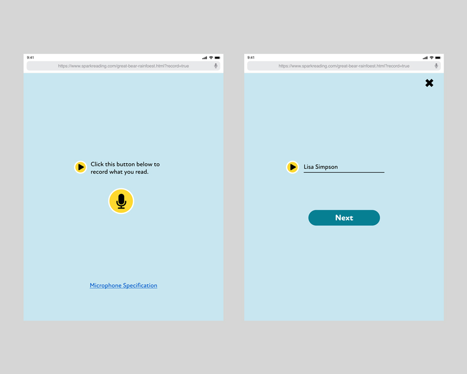
Using Figma to create the high fidelity prototype. The colours, fonts and other design styles remain the same as the activities.
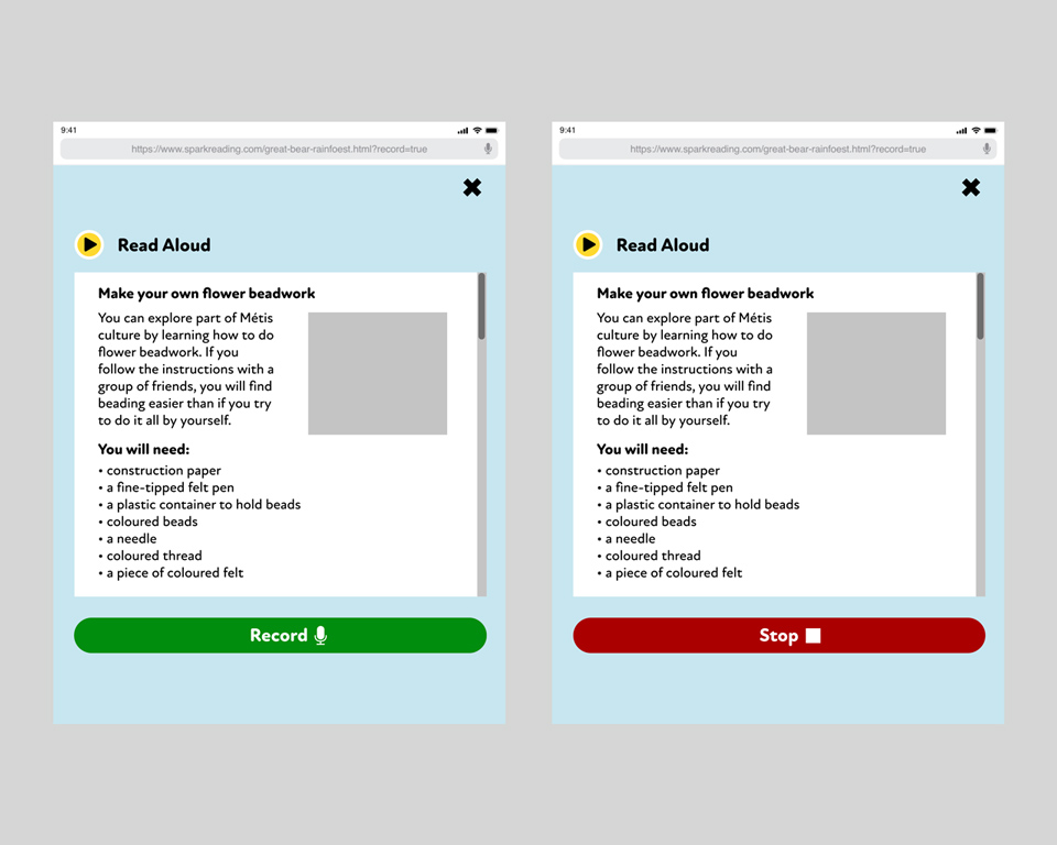
The button record and stop are implemented as the same button, so the user only has to click one button to do anything. Can view the full high fidelity prototype on Figma here
What I learned and what I go out of this?
What I attained from this project is that a lot of functionalities can be combined together to perform 2 different tasks instead of having them as individuals. Record and stop buttons reduced to 1 where the user can click just 1 button to either to start recording or stop it instead. The second instance of this is the download and close buttons combined together to download the voice recording automatically and close the recording feature all at once.
As a result of reducing the amount of buttons which cause lesser amount of clicks, the better the user experience became overall. For something that was created and targeted for younger children, the user experience should not take that many clicks just to get something done. This streamlining prevents the user from making unnecessary mistakes and it makes this feature easy to understand what they need to do.
How did I go about in solving this problem?
This part of the project I had to work in different steps than my previous ones. In a rare instance, I was at a live discussion where I had to take notes during a moderated user focus group session. How this was organized was that this was all set up in a regular room with a group of teacher participants with moderators asking questions about their experience with younger students during class time.
Using this information gathered, I was able to decipher that younger kids like to create anything from a blank canvas. This can be an entire environment world like adding trees, building house, roads, …etc. or be very dedicated in customizing the visual look of their online character personas in the games they played. For example, these traits are very commonly shown for boys that like to play with Lego and build something out from an empty board or girls with their Barbie doll whom to be fond of playing dress up with them and role-play. Using these type of data collected, I was able to create some personas to meet those criteria and adjust the organization’s product goal towards that direction.
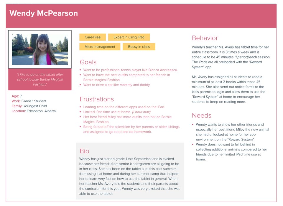
Personas were created from Xtensio to test if these characters can match the user needs and requirements of this reward system. In the image above, it shows the characteristic attributes of this persona are mainly found on average grade 1 girls. It is these attributes that I want to use to evaluate and build the product around for the intended user.
The second step on this project was internal meetings for people associated with this project. In summary, what we want to get out of the meetings using the personas as our main users was that we want to have an open canvas and let the younger kids decide what they want to customize on it. All these assets can be customized through rewards acquired by paying with the activity currencies that is earned through non-linear ways. Coincidentally, this is also something I am very familiar with or have experience because of the games I play during my free time for my hobbies. There is a lot of comparison between this reward system and the current games out there right now. Today’s games are full of shops or marketplaces for customization and skins. This is a huge plus to keep them interested and continuously engaged because it allows for more options in changing their environments or characters. A similar product feature is also found in Raz Kids however they are only limited to creating a rocket ship which is not every kid’s interest. In order to prevent this from turning into a game completely, we had to make sure this reward system is actually for educational purposes first and fun entertainment second. How we solve this making education first was that the kids have to read the books before they can earn any currency. The currency is also given at random times as well for kids that are not very strong readers to keep everyone fair.
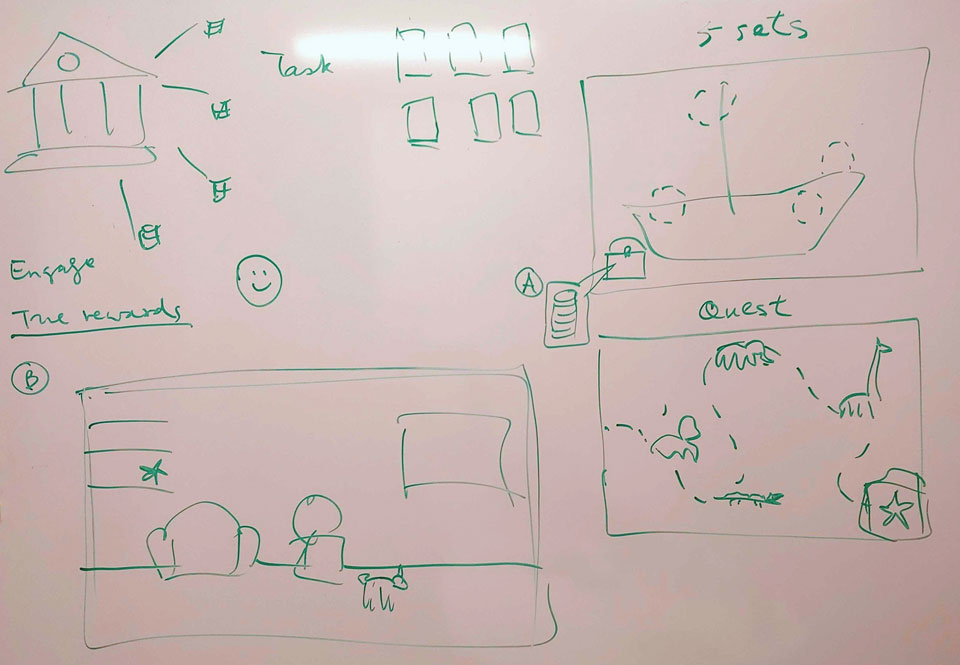
Ideas drawn on a whiteboard during meetings to showcase the number of environment possibilities that the user can pick and choose with the activity currency purchases. In this example we have scenes like a ship in the ocean, the zoo and even just a general living room. All of these scenes also contain a "chest" container to hold all the assets of the user which they had earned previously. These assets can be smaller perks to make the environment more lively such as trees, chairs, signs, ...etc.
What steps I have used to overcome the problem?
User focus group session, research on characteristics, personas, low fidelity wireframes and user webflow. The user focus group's main purpose was to collect data information of both pros and cons of children's behaviours and what are their likes and pet peeves of certain things in a classroom environment. This data would not only be used to create the final product but also create personas that align with the product's vision. The research itself was to create a more precise persona character which can be used for in house testing trials before getting real users to actually test the product if it effective or not. Low fidelity wireframes were created for the overall first round designs and finally a user webflow to map out how a user can navigate the reward system web application.
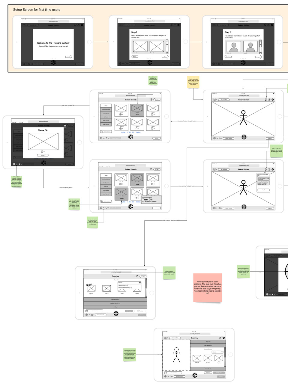
A low fidelity prototype of the reward system that also doubles as a user web flow diagram as well. This diagram shows the steps from the very beginning to creating a basic starting character that has no assets and a default background to the steps that the user can do to get more currency to populate that character and environment.
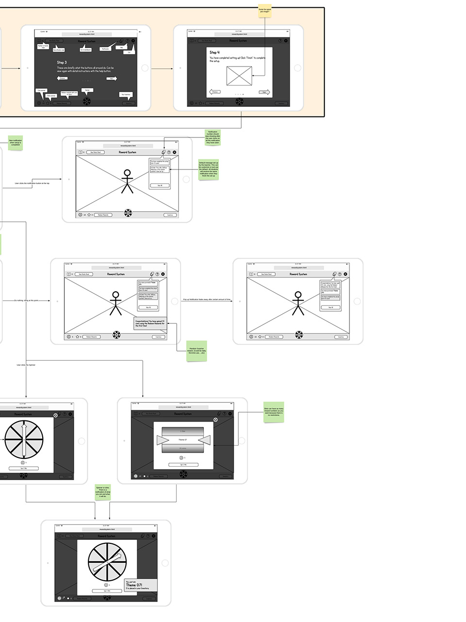
During discussion with stakeholders, a spinner was introduced as a way to also collect currency for the user because it gives a chance for younger children who do not read very well to still be able to get the best things to populate their characters and environment.
What I learned and what I go out of this?
Before I left the organization, this feature is still ongoing because the high fidelity prototype has not been build yet so it has not passed stakeholders requirements nor been tested with actual young students as of yet. However, the groundwork has already been completed such as personas to imitate the actual young students to create different use cases. A somewhat completed user webflow is there to give a general idea how the users will interact with the product and what they can expect this reward system to do.
Other things I got out of this is that, the organization is trying its best to not to gamify this reward system because as mentioned before the reading of the eBooks should be first priority before the fun entertainment part. This is why in the end they have decided to use the eBook reading as the main method to gain in-game currency to purchase assets and environments. For the weaker readers, the random currency gain and the spinner was introduced as a way for them to catch up to younger children that were more expertise in reading. In the aftermath of introducing the spinner, it gives everyone a fair advantage regardless of reading skill level.
I also learned that the use of personas allow me to narrow down what the user will like to do such as customization of certain things. The result of creating personas allows me to sell the product much more convincing and believable for stakeholders. In anticipation of limitless customization as the main feature, I am looking forward to seeing this as the primary driving force on retaining the current users to continue reading at their own pace while still having fun as well.
Let's view more case studies!
Click the buttons below to go to another case study.