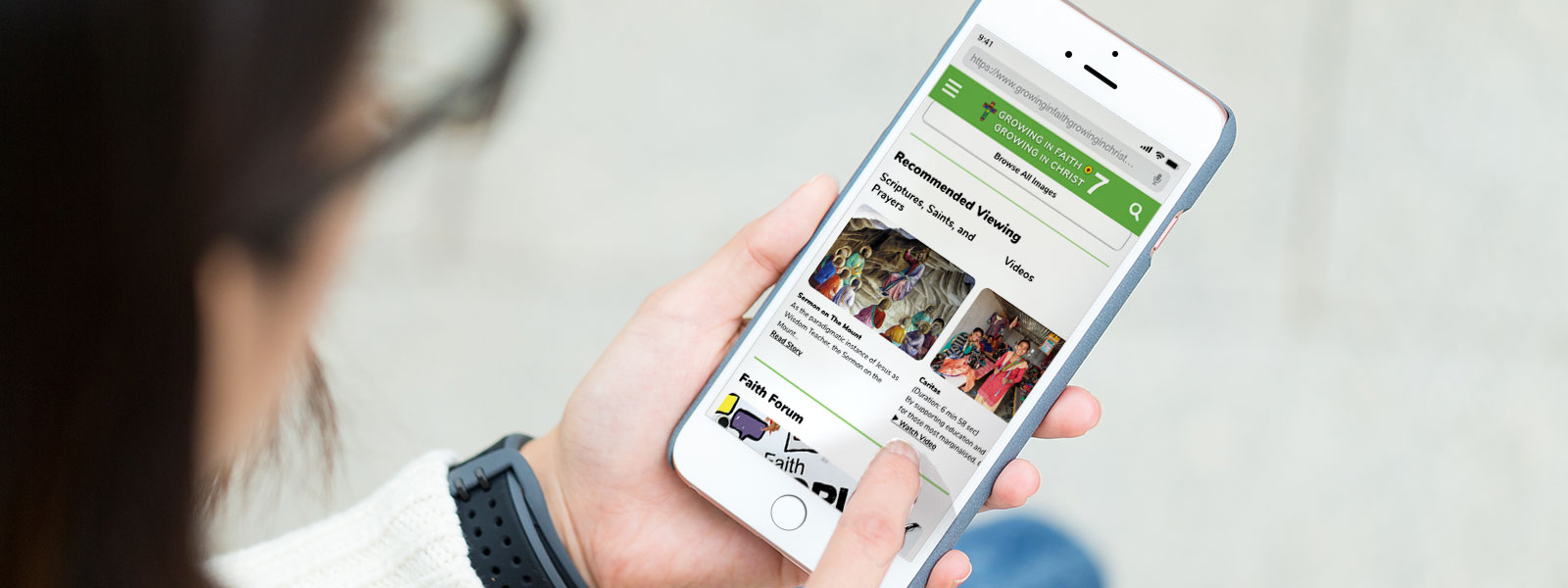
Growing in Faith, Growing in Christ Grade 7 Catholic Interactive Website

Company:
Pearson Education Canada (Growing in Faith, Growing in Christ)
Application:
Website & Web Application
Main Platform:
iPad Tablet, Android Tablet
Tools Used:
Powerpoint, Google Sheets, Adobe XD, Xtensio, Visual Studio Code, Adobe InDesign, CodePen
My Role:
User Interface Designer, Quality Assurance Tester, Wireframing, User Experience Design, Persona Creation, Researcher & Presenter, Web Developer
Target Audience:
Grade 7 - 8, Catholic Schools
Who I Worked With:
Book Editors, Web Developers, Third Party Vendors
Project Time:
Estimated 1.5 years. Completed.
Growing in Faith, Growing in Christ grade 7 catholic interactive website is a brand-new website that Pearson Education Canada wants to create from ground up to be used by grade 7 students at the start of September 2020. While previous grades ranging from grade 1 to 6 already have their own version of the websites completed, this new website will be used not only for grade 7 but the same layout will apply to grade 8 as well. So in general, this website is basically for both grades 7 and 8 with image swaps for the higher grade. Included with the website are the eBooks that are associated with the website's grade level. The physical copies of these books are used in classrooms for both teachers and students but electronic ones can be used by students that wish to use it at locations other than schools.
The organization currently has websites set up from grade 1 to 6 for students to login and learn about various information regarding the catholic faith. Unfortunately, the grades 5 and 6 are the only ones that are modern in today's standards for user experience but it is still far from perfect. For the higher grades such as the 7 and 8 students, the organization wish to make use of today's new designs and trends. If they were to instead follow the same path as grade 5 or 6 using the same design and user experience, there will be much more time needed for correcting issues in the future. There is also a possibility based on the success of the grades 7 and 8 product that the organization will come back to revisit and revamp the younger grades (1-4) websites with the newer designs and trends because they are currently out of date.
Another issue that will impact the design of the new websites is that the grades 7 and 8 students have a different age gap from grades 5 to 6. The older kids way of thinking, interests and general maturity will be way different between the two groups. As a result of this, using the same template idea that saves money and time will not work very effectively for the end user. The third issue while not really a big issue is that the website will develop by third party vendors. The conflicts that can arise from using third party vendors is there can be a lot of miscommunication on what the organization wants the product to do and what the vendors understand. I have witness this firsthand and it is something that is regrettably unavoidable even if everything seems to go perfect in the beginning.
For the eBooks unlike the website their design are similar because the physical version of the books follow the same layout thus making it possible to have the same design theme. The organization needs to have these eBooks behave the same way whereas the website has to look and behave differently. Be that as it may, the issue with these eBooks are that they have many pages per book, almost 200+ pages. It requires too much of the designer’s (me) time to come up with designs for each individual page.
This project case study is split into 2 different parts:
Website
eBook
The goal of the new website is to design the grades 7 and 8 websites using today’s modern technologies, interfaces and experience standards. These new characteristics should be engaging to the intended users while still keeping some elements similar to the grades 5 and 6 websites. Although the new websites that are going to be created are different visually and function-wise, they still belong to the same Growing in Faith, Growing in Christ series.
For the eBooks, the objective is to find a solution that is usable for book editors, vendors and the designer. This solution needs to reduce or even eliminate the time the designer needs to create, edit and maintain the designs. The best case scenario in the long run is to just minimize the need of the designer’s time in participating on these eBooks.
How did I go about in solving this problem?
Since this is a new product itself, there was zero data to work with from the very beginning. The only information presented were hypothesizes of behaviours of young teenagers and statistics of grade 6 students on technology use from stakeholders which may or may not be practical to this new website. So in order for this website to start on a good foundation that can be build upon on plus for stakeholders to be convinced about the project, I had to do an indepth research and present it in a way that can sell it to them sufficiently by mentioning the pros and cons of my choices.
In my research, the important key points that I was looking for were current web trends on sites that are popular with early teenagers. I also look into existing user interfaces that are prevalent and effective to the current year as well. These sites for example can be range from clothing stores such as the Gap, Aritzia, H&M or Rebook to streaming sites such as Netflix or Twitch TV. Other than looking at the designs only of these websites, I have also played around and taken notes of the behaviours of social media sites because a main aspect of this site which I wanted to include was sharing between peers. I took a look at how Facebook, Twitter and Instagram behaves. I also took a look at other sites that have sharing and social media options that are not as popular as these social media big three. While researching new ideas are important, I also had to consider some of the functionality and designs from the previously done grade 5 and 6 websites because these books are an entire series, so there has be some elements that are identical to tie the websites together while looking different at the same time.
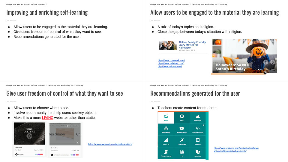
A Powerpoint presentation was presented to stakeholders from my findings of my research. In point number one, it is to create content that appease to the actual user's interest rather than forcing materials that they do not like or care. The content should be engaging and interesting, such examples can be content that related to the user's every day lives or current events that are happening right now.
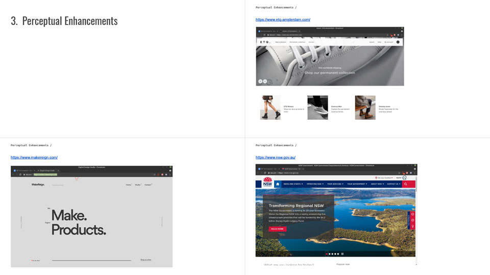
The webpage product should catch the user's eye when they first land on the page. Through my research, a user is more drawn to websites that are animated in some way or form. A static website might be effective functionally but in the end it might be too boring for young teenagers because they are more tech savvy and use to going on other websites that have full interactivity.
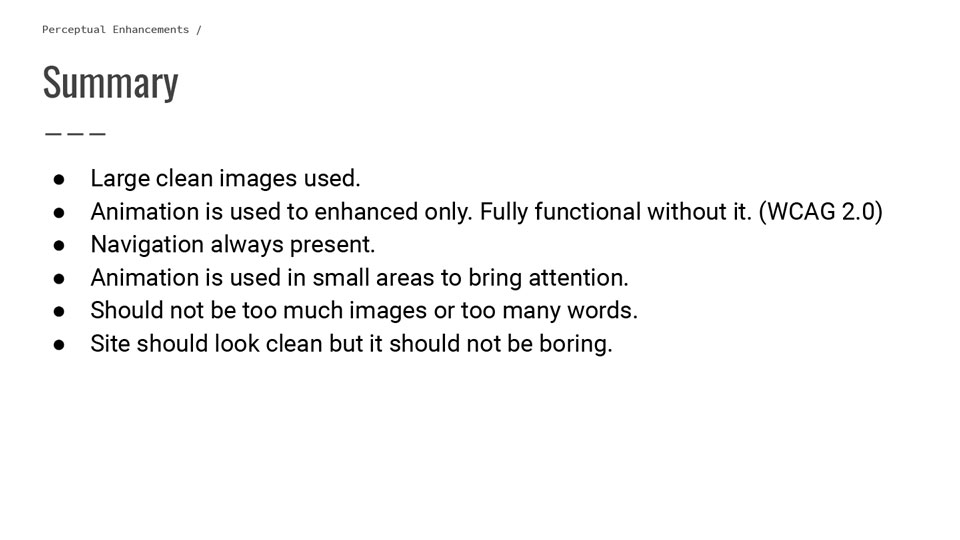
These are the key elements on what to do and look for when trying to bring a website to life without overdoing it or overwhelming the user's overall experience.
From the data collected and presented to stakeholders, they were able to decide on what they like and did not like in this newly to be created website. In a related task of collecting this important data I have also used it to create personas which can determine the expectations, difficulties, behaviours and final goals the young teenagers might have when using the product. These personas for this project are not only for the end user but as a second functionality, it is used in changing the business decisions of stakeholders. One example that was encountered by stakholders was the decision of lazy loading everything or pagnation in sub pages. We then use the personas to test and justify reasoning to keep which of the features within the website. Lastly, with the finished personas, the stakholders and me were also able to create user journeys, web flows and narrow down functions/interactions.
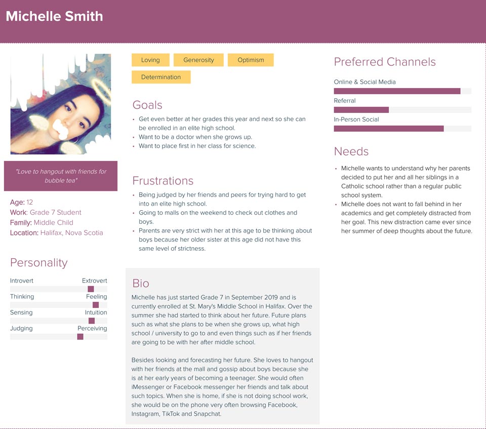
Persona created using Xtensio from website statistics and attributes collected during research. This persona is used to test if this character can match the user needs and requirements of the grade 7 website. A key characteristic from this generation of people is that they are very good with technology and it is this information that can affect the whole overall of the product.
A user webflow was built by me to show how the user can transition between pages. Basically it allows stakeholders to visualize a map of this website’s entire structure. However while the low fidelity wireframe of this webflow was used as a startup to determine some functionalities of this website, majority of the design and functionality decisions had to be made on the high fidelity prototypes because the low fidelity designs were limited in space while the other presents a clear vision on how it works for stakeholders.
A user journey was built next after the webflow was completed. The reason it was created because it allows me to pinpoint from the user web flow when and how to meet certain conditions. It was also created to test if certain key functions are viable or needed in the final overall product.
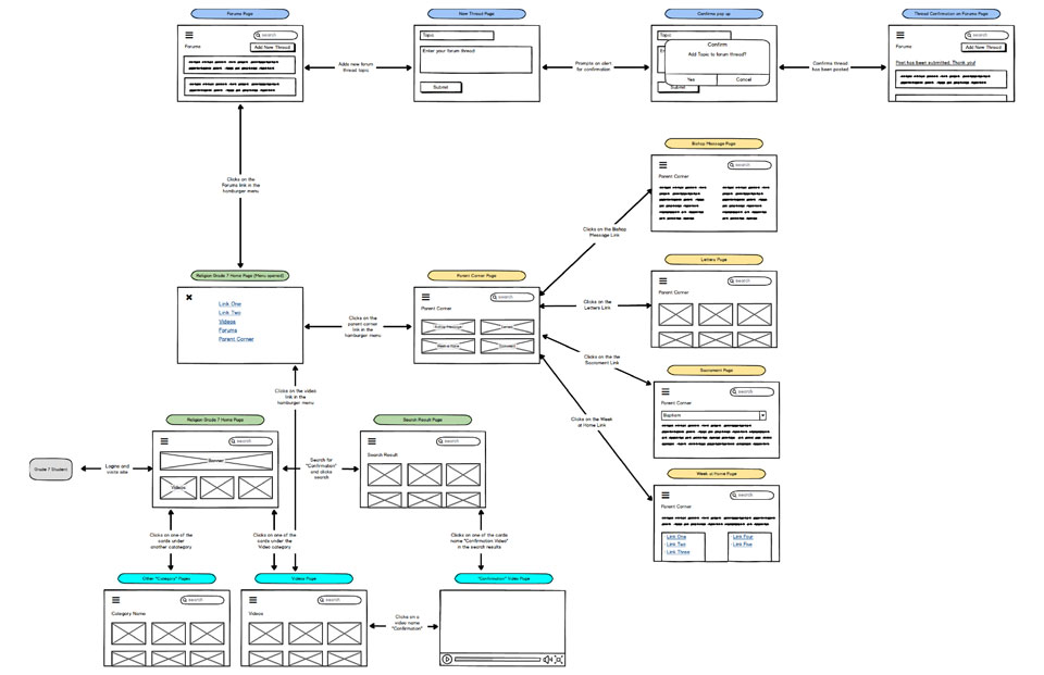
A first attempt of a low fidelity user webflow created that maps out the entire system of the Growing in Faith, Growing in Christ website. Not all the functionalities are shown on each of the page because at this stage, it was still not in conclusive on the smaller functionalities. In the image shown, only the main functions are presented.
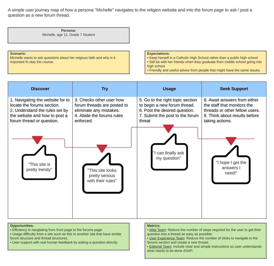
This scenario was place inside a user journey to see if this functionality was needed or not. Stakeholders will then use this user journey case to determine if it is important to be removed, kept or even improved on it for a better outcome.
For the process of finding a solution that can be streamlined for third party vendors developing this website, I had to create a some sort of guide. The use of this guide is to bridge the understanding between what the stakeholders wanted and what the vendors can produced. A design documentation was the overall solution to solving this problem. This design documentation is for vendors, so they can follow certain guidelines while developing this website. Examples found within the guidelines are, colours, font sizes, typefaces, and fixed widths/heights for elements just to name a few. This documentation produced is also a live documentation because it needs to be updated while the vendors are working on the website. For instance, the vendors might pick up something I have missed or the stakeholders found something that needs to be changed. All in all these discoveries are very important in order to have a good relationship between both parties since it is a way of helping each other.
What steps I have used to overcome the problem?
Research, presentation, personas, user webflows, user journeys, low/high fidelity wireframes and lastly a design document were used in achieving the outcome of this problem. The research compare to everything else listed was the most important step because as a brand-new project with zero data to work with, it will be difficult to build anything without any knowledge. A good foundation must be created first in order to set the pace of the following steps to come. Powerpoint presentation was next after the research and it was used to present my findings to stakeholders, so they have an idea what to expect from this project in user interface, experience and possible functionalities. Creation of personas served a purpose to understand how an average user will use the product thus allowing the stakeholders to take notice and make adjustments accordingly. The user webflow objectives are to display an overall map of the entire system. Purpose of creating the user journeys are to mainly test and answer use cases that are found navigating through the webflow. The low and high fidelity sketches are staple to any design that requires approval from higher ups. As a double purpose, these wireframes also make sure the stakeholders are informed of the build up leading to the final product so they would not expect any surprises that are out of scope.
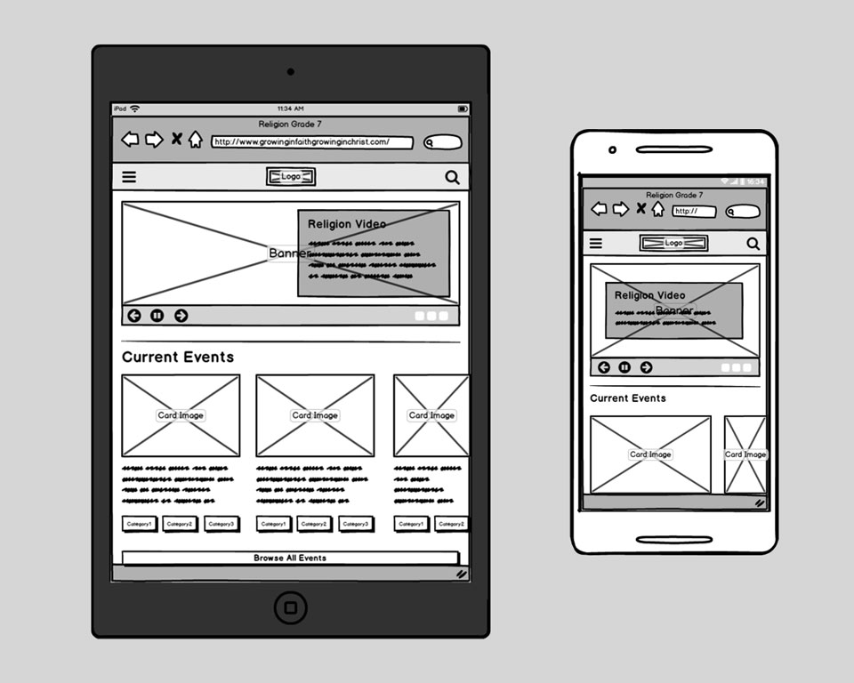
Balsamiq low fidelity prototype for the landing homepage with a clean and simple design. Some site elements are commonly found on any other websites so the user has an idea what to do when they first land on this website. Such elements are navigation presenting at the top corners and the hero image as the main focal point.
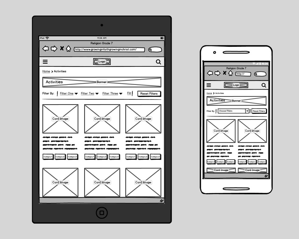
Activity page when the user clicks the link to the activity section. All the activities are in a card format to show a listing of all the activities of this website. There is a filter feature at the top that allows the user to narrow down to what they want to see based on the keywords inside the pills of each card.
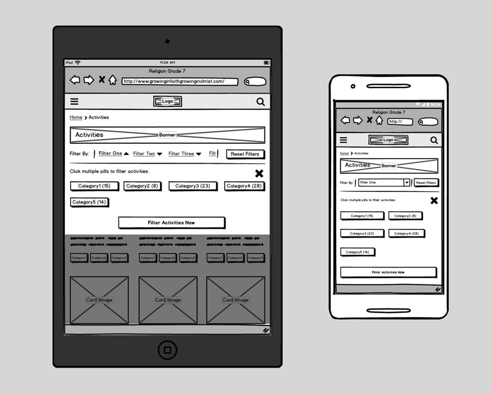
On the same activity page, when the user clicks on the filter option at the top, it expands the options on how to filter the activity cards on this page. This webpage will then update asynchronously for the user afterwards.
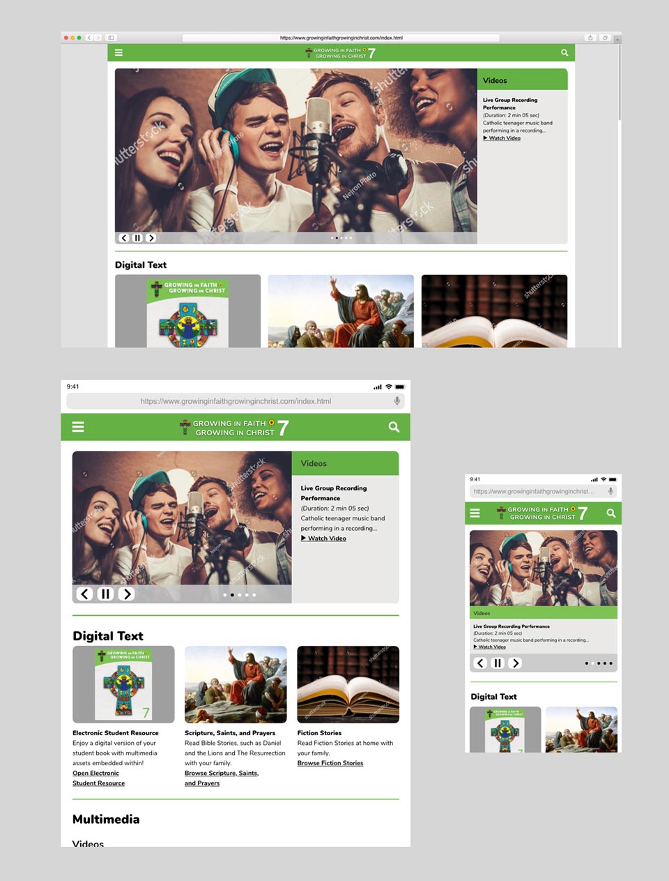
High fidelity prototype for the homepage done on Adobe XD to showcase the main devices that will be used. First is the tablet and in second place is the desktop. While viewing and doing activities on this website using a mobile phone is not the recommended, a mobile view still has to be there for those individuals who wish to view this website on their phones.
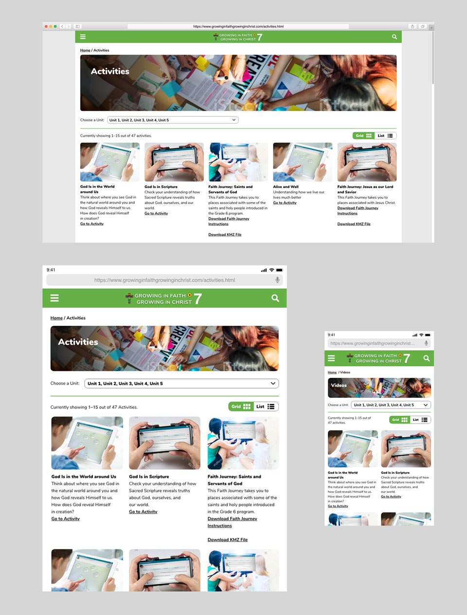
High fidelity prototype for the activity page displaying all 3 viewing devices. The overall designs of all 3 look similar because that was the approach I was trying to achieve. I wanted to create a design that was both effective in interface and easy to code through responsiveness. In this image example, the cards wrap to the next line. So regardless on what type of viewing device resolutions the user have or the browser they are using, it will still present them a good user experience.
Finally in order for this site to be build by the vendors, a design interactive documentation was created in InDesign and passed on to the vendors as a PDF file. This was sent as PDF format because it has clickable table of content navigation so the vendor can access each component quickly within a 70 pages documentation. This documentation includes colour codes, measurements, margin sizes, padding sizes, typography and much more.
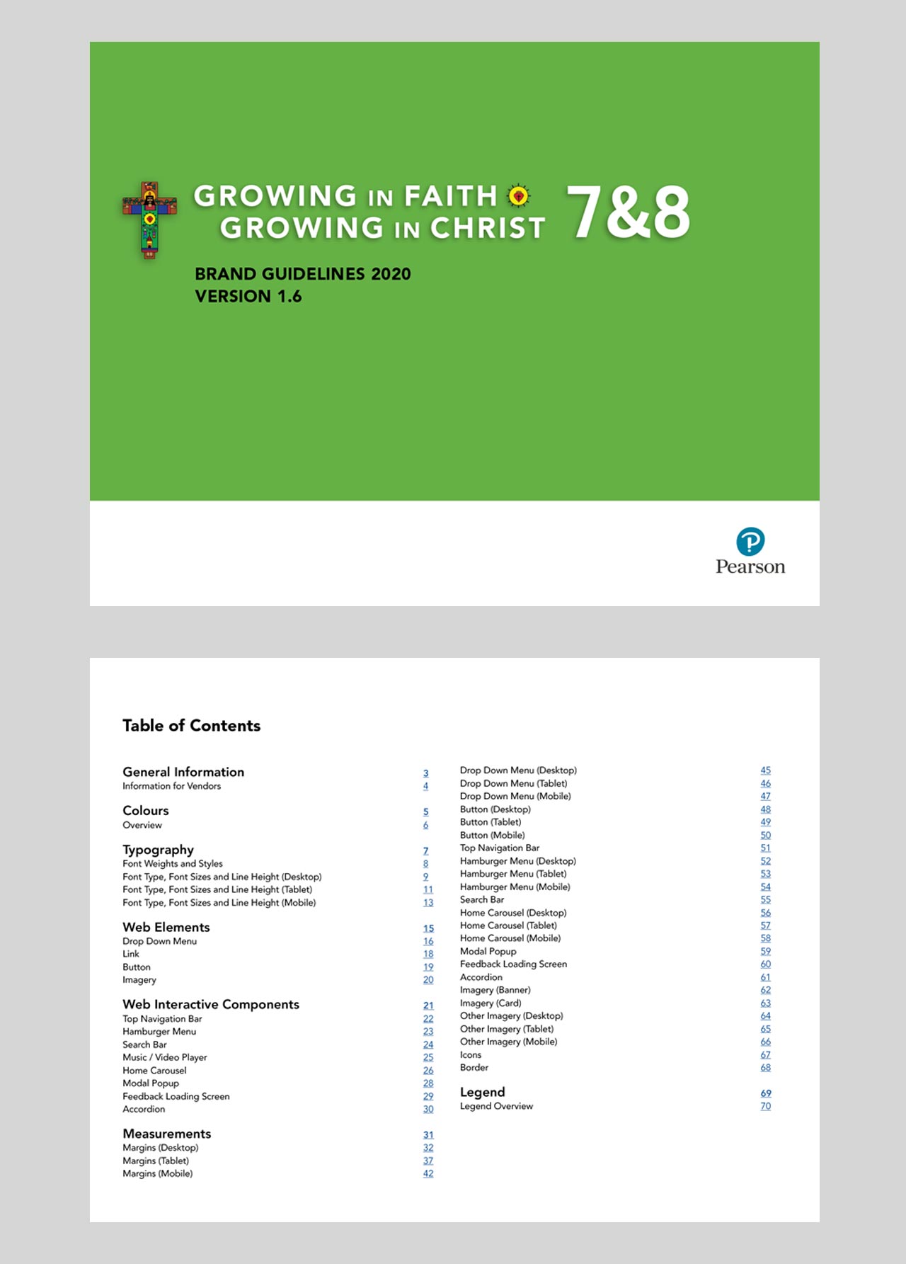
A PDF design documentation for the vendor that is constantly updated and versioned controlled. The final version required 6 iterations and the table of contents have links in the page numbers that makes more convient for the vendor to navigate to that specific section.
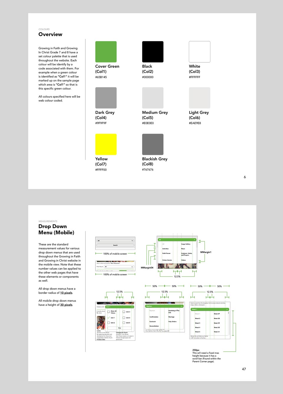
A palette of colours are used on this website and these are the hex colour codes that the vendor will be using in their CSS. Both of these images have a naming convention for their specs which the vendor will then go to the last pages that has a legend to decipher the meaning. These naming convention when decipher usually indicated numerical measurements because this website has a constant theme, so elements that belong to the same category should have the same sizes (Eg: Headings have the same typeface and size throughout each of the webpages).
What I learned and what I go out of this?
The religion grade 7 website is currently live right now and being used by catholic schools across Ontario. The grade 8 website that will be released sometime in the future will use this same layout but replaced with different images and content. Some features proposed during the presentation and low fidelity wireframe phase generated new issues that had to be cut due to technology and/or budget constraints. The new problems that arise in features are for example in the forums page. In this particular page, it requires a database full of usernames and passwords. In order to store this private information without security leaks, a lot of safeguards logic is required and to be developed which adds to the final cost. Another problem on this same page is that it requires multiple moderators to monitor different categories for third party posts to be appropriate for all users across. In the end, some of those features were forced to be removed, simplify and then rebuild to alternative versions. For the alternative version of this forum page, we had to change it from a larger scale to a smaller scale by allowing users to ask questions via email thus a single moderator is only needed just to read and reply. In addition to pigeonholing to a single moderator, multiple accounts were restricted to a fixed single classroom account which the organization will provide the username and password.
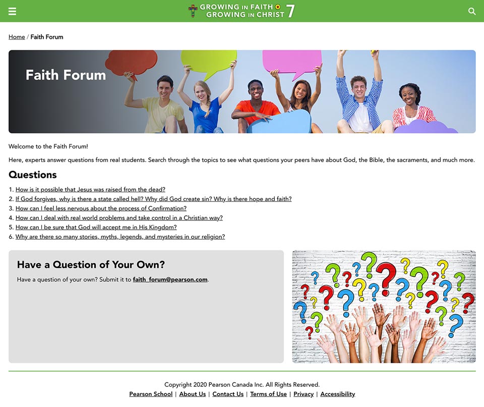
The Growing in Faith, Growing in Christ grade 7 faith forum page in the final product. Based on the decisions and testing we had earlier with personas and user journeys, this faith forum page had to be change from an actual forum into a more controlled Q&A section that uses less of the budget to maintain over time.
There were also modifications on the homepage to make it more friendly and to give the user a more pleasant user experience when they first land on this page. The hero image with side text originally was what the user will see when they first land on the page. However that feature had to be change to an image that has welcome text in it before seeing the images with side text in the carousel.
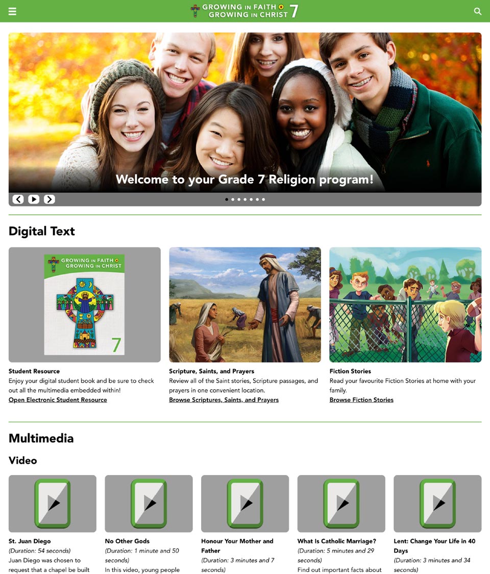
The homepage hero image had to be change from what I originally had because it required a more friendly approach when the user first enters this website. This simple change adds to a better user experience and it did not require any costs.
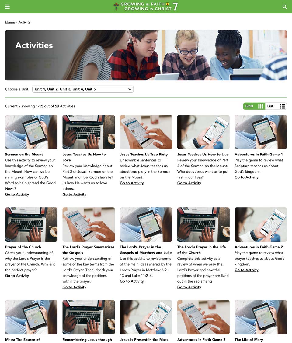
This is the activity page for the final product. The complicated filter feature was taken out in favor of this simpler version for the user. Since the simpler version was implemented, the filtering pills were also taken out of the cards because it is not that important for the end user to see.
Aside from solving the problems, there were also a lot of positive feedback. Base on the conversations of the stakeholders that are part of sales, they mentioned that this website is getting a lot good reviews from the schools that purchased this item and it is connecting with the intended users which is exactly what the organization wants the product to do. This is also the result I would like to hear as well because it solidifies to what I did from the beginning to get to the end successfully. What I really learned out of this is that the research phase was very valuable. So invaluable that it helped me in creating a product that is more aligned with the user rather than just getting it done quickly that appeals to stakeholders. The feedback in the end whether positive or negative, especially negative that we got from the finished product shows that it is also an important phase because it allows the organization to make adjustments accordingly and to decide if more budget should be poured in to fix these issues. As a result of all these extra tasks and out of the box thinking I had to do, I was awarded with an “Innovation Award” from the organization.
“... the research phase was very valuable. So invaluable that it helped me in creating a product that is more aligned with the user rather than just getting it done quickly that appeals to stakeholders.”
How did I go about in solving this problem?
The main goal for the eBooks for this religion project were to reduce or eliminate the need for the designer to spend too much time on modifications. The solution that the organization and me thought of was to use something that is similar to a Bootstrap framework but in a design format.
In Bootstrap as a web developer, it is a popular CSS framework that gives resources for them to build proper design structure websites while making sure it is responsive for all viewing devices. In this scenario with the eBook version of Bootstrap, it requires minimal work in CSS from the web developers. The main tasks the web developers need to worried about are the HTML DOM, javascript and/or any backend framework that they need to include within the project. In this instance of a solution, it is a custom framework for the designer to output designs into then for people developing to take those designs and use in the projects. However besides the use of the designers and developers, the book editors can also use this framework because they can choose the design that are in the examples then let the developers know how the eBook should be structured afterwards.
For me as the designer to solve this problem was to take the designs that are currently in the physical books and change it to responsive format using CSS. My approach is to preserve the current look of the book as much as possible while still being accessible, responsive and possible to be created in web format. Some of these solutions came from quick sketches and senior developer feedback to see how the web version will look compared to the book. Since the sketches requires a lot of effort for explanation then bouncing those ideas back and forth between me and the developers, I was in charge with coding the CSS myself. I was given this task because while I can create any designs on my prototype software, it also needs to be able to be coded and work for the web. For example, there is a fixed HTML structure I have to follow, I can not make a box go to the right side on the opposite of the screen while something is on the left because the HTML has limited tags and unless I write more HTML, than it can be possible.
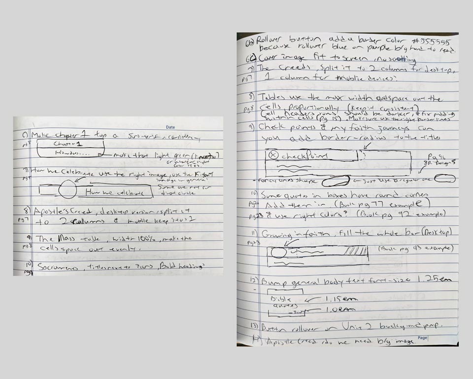
Sketches were quickly drawn to compare the web version of the design to the actual book version if they look similar and to get senior developer feedback. One major key I was trying to go for is to make sure it is possible for the web to look like that without breaking accessibility and also possible for the structure to actually move around when the screen is on a smaller viewing device.
This design Bootstrap framework is separated by grade so each book has its own set of design objects. However, some of the look remain the same because those objects share similar designs within the book, so there will be reuse of designs throughout. After a long discussion with trial and error with the team and me, we were able to break down the entire eBook and split into 4 different categories:
Elements — Those are your standard paragraph text, titles, lists, blockquotes and images.
Styles — Those consist of font sizes, font styles like bold or italic and colours for web objects.
Layouts — Those include spacing, alignments and location of objects.
Components — those are big pieces like a whole accordion that houses many elements, a card that groups a bunch of elements that looks like a single box, sidebars, …etc.
Within these 4 categories, all the designs are there and finalized to make up the whole entire eBook. The job of the editor is then to pick and choose the pieces they need to build this into an eBook format. The developer uses the code snippet associated in this design Bootstrap framework to make the design appear on the web player afterwards.
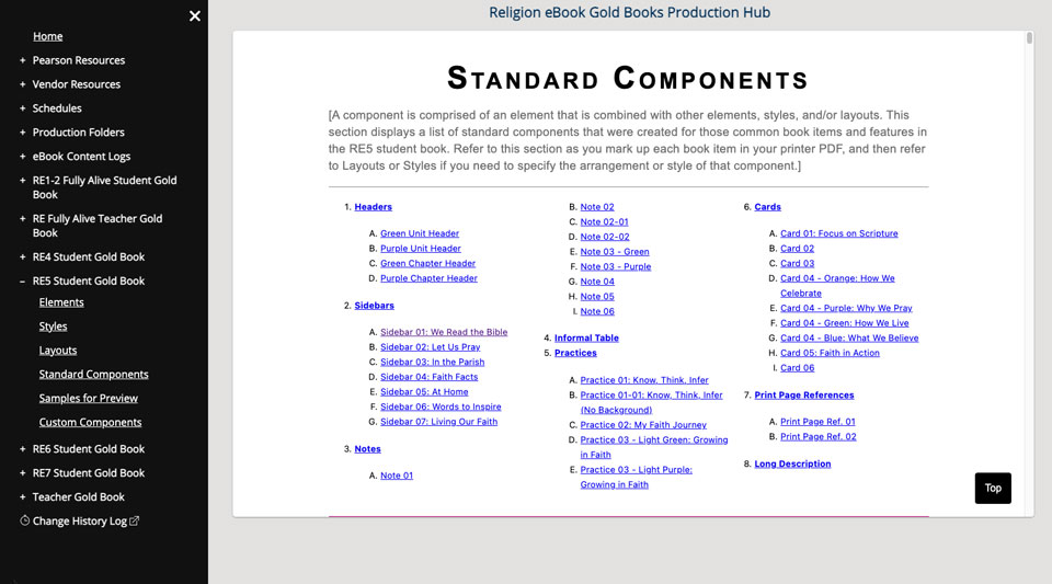
A design Bootstrap framework was used by all parties that were involved. The above image shows the "components" category that contains different components in the eBook. A single component also has many different versions, in this example for the sidebar, there are 7 different types therefore 7 designs were needed to be created.
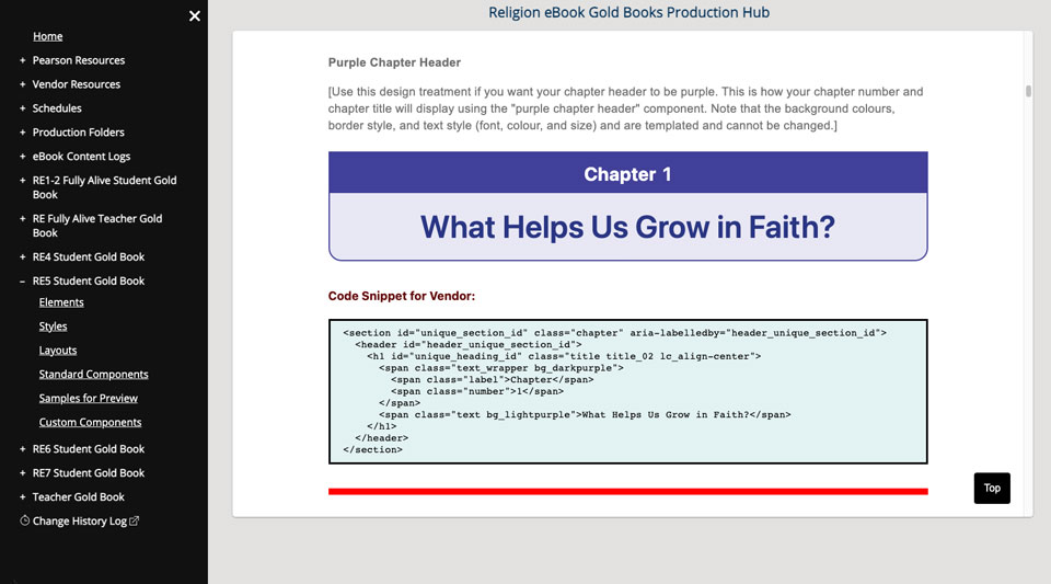
Both editors and coding vendor come to this site to get the design and the code snippets to build the final version of the eBook. Since all the key design objects are in this framework, these eBooks can be mass-produced quickly in the long run.
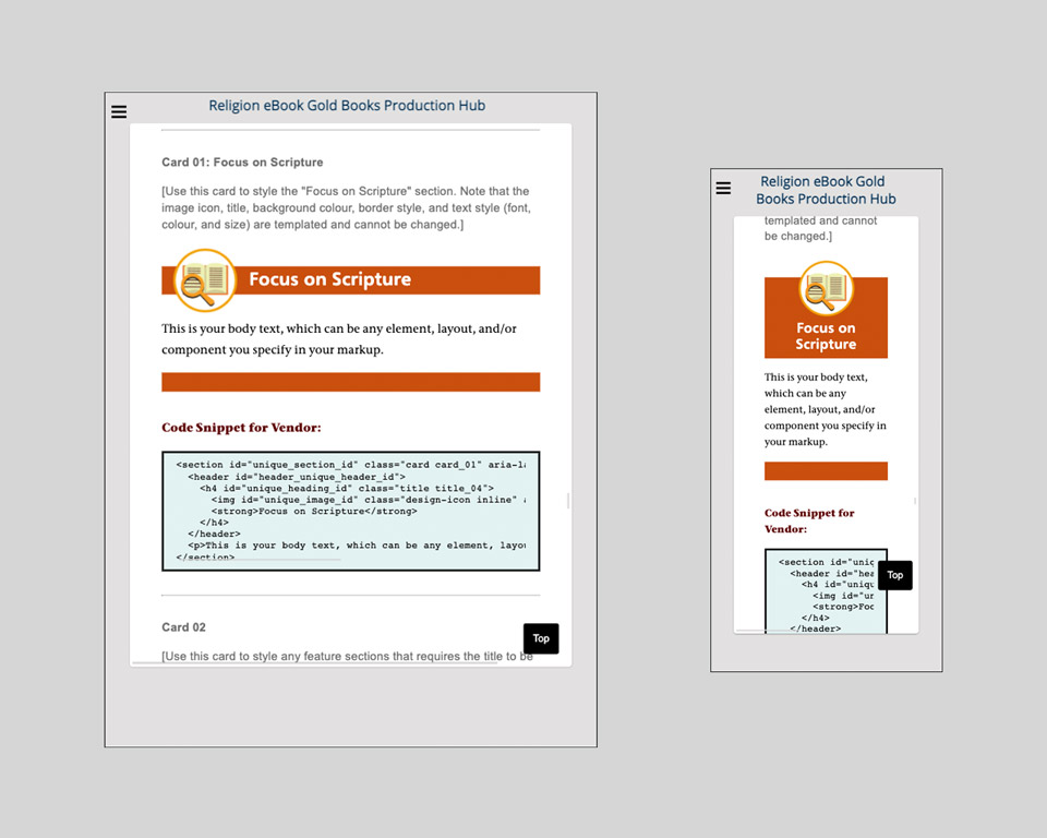
This framework with its designs are coded to be fully responsive on all viewing devices. The design has to change slightly because on a phone there is less width so the title and the logo had to stack on top of each other to make the design presentable.
What steps I have used to overcome the problem?
This case requires a complete different approach when using pen and paper for sketches on the low fidelity wireframes. This phase in the project did not require wireframes because this is for internal and the organization already knows what they want for the product. A lot of the ideas were taken already directly from Bootstrap and also backup by the organization's internal developers input. However the resource of using pen and paper was then directed to only for the designs that will be for the eBook instead.
The reason I was coding the design myself is to reduce issues rather than going back and forth continuously with the developer instead. In order for me to administrate this task, I relied on my previous knowledge of coding and perform trial and errors of the code on Codepen to see what works and cannot work.
Lastly a well written description and a working example are presented to editors, so they can pick and choose what they like to see within the eBook. For the third party vendor to understand this framework, we also have vendor specific instructions and code snippets which they just have to copy and paste into the HTML file to build the eBook.
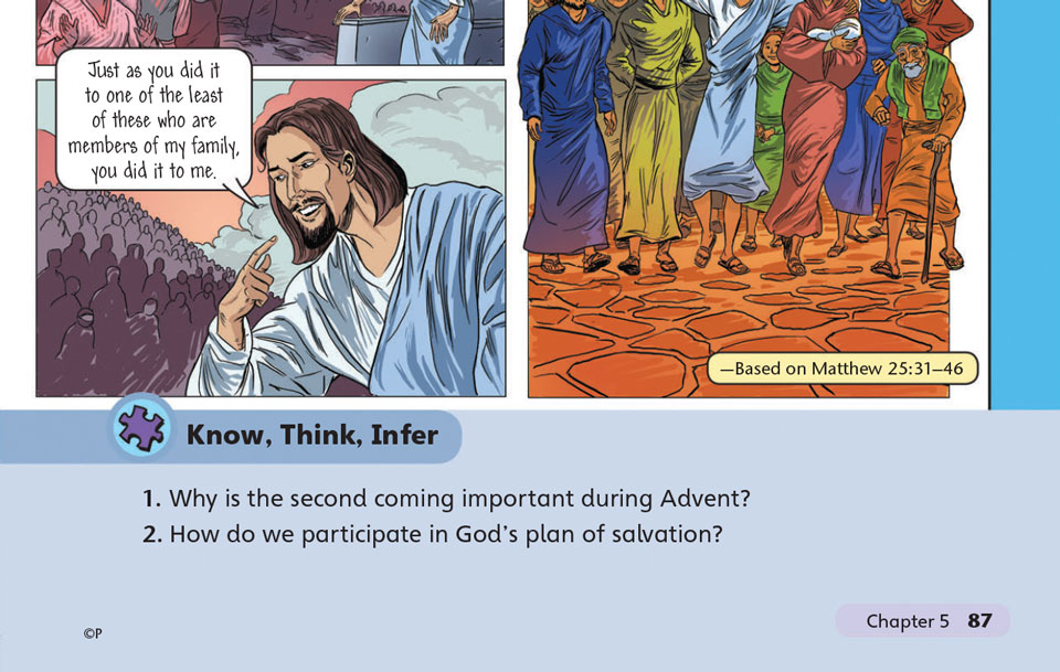
This is a page from the original book. The designs are taken from it and need to be transformed into web format.
See the Pen Purple Unit Header by William (@terrawing) on CodePen.
The HTML is limited and the structure cannot be altered because this is the correct way to make sure the eBook meet proper standards. All the CSS I have to create has to be based on this structure otherwise screen readers will not read this correctly and not pass W3C accessibility.
What I learned and what I go out of this?
The final product consists all the design and instruction components that can be used by all parties in any specific grade. With this new framework now, the book editors are able to pick and choose the pieces to match the design of the physical books. For the third party vendors, they are presented with all the assets including extra files (css & javascript) for download to be used in the HTML files flawlessly. Finally, as for me the designer, my work to maintain this is probably 2 or 3 times in the whole iteration of a single eBook.
Unfortunately with this design Bootstrap framework, the best outcome the stakeholders want to achieve which is the elimination of the designer’s time was not achieved. However, the tasks to maintain was reduced drastically, which is the purpose of creating this in the first place. What I learned out of this was that my CSS knowledge has majorly improved from my previous knowledge and this allows me to present designs that are much more advanced and achievable through the web unlike before where there used to be more limitations.
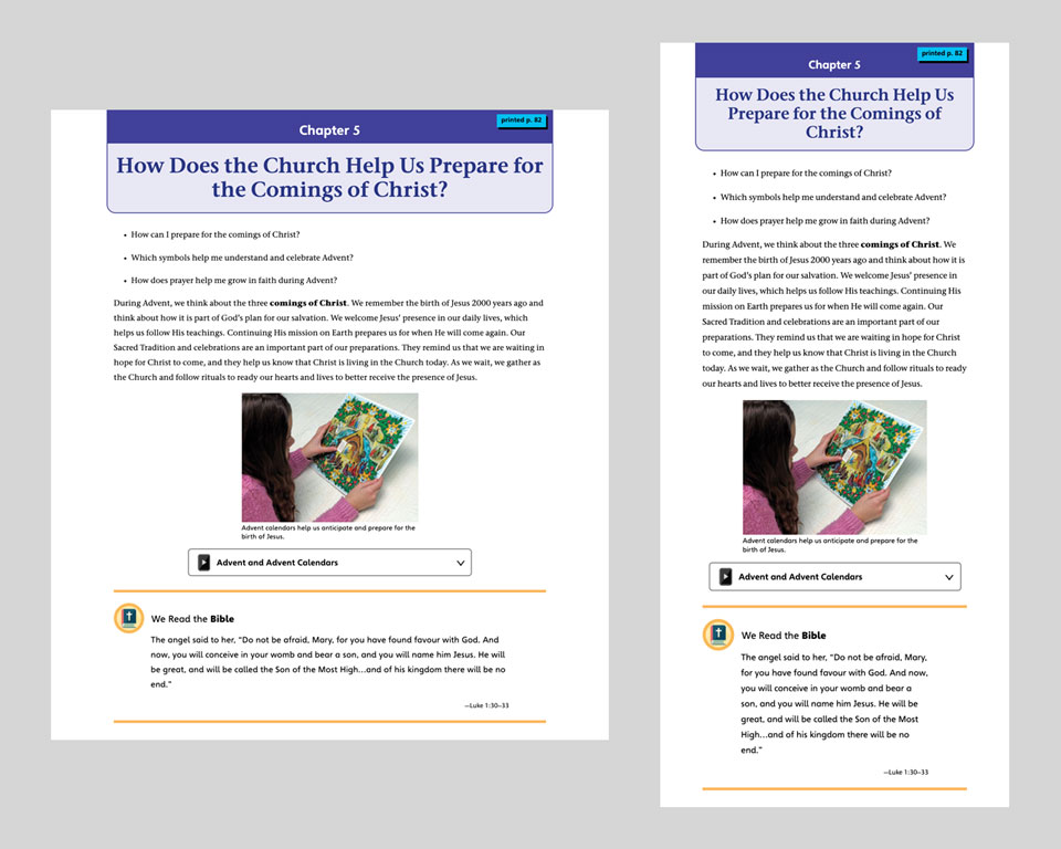
Final design of the desktop and tablet view when all the designs are pieced together and displaying in the eBook player.
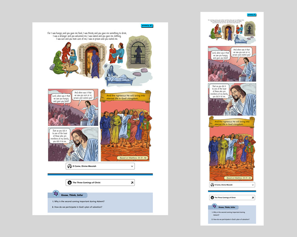
More designs in the desktop and tablet view that are pieced together and displaying in the eBook player.
Let's view more case studies!
Click the buttons below to go to another case study.