Mathology Digital Tool


Company:
Pearson Education Canada (Mathology)
Application:
Web Application
Main Platform:
Desktop
Tools Used:
Lucid Chart, Pen & Paper, Adobe XD, Powerpoint
My Role:
User Interface Designer, Quality Assurance Tester, Wireframing, User Experience Design, Researcher
Target Audience:
Teachers, Teaching Sector
Who I Worked With:
User Experience Director, Researchers, Designers, Web Developers
Project Time:
Estimated 2 - 3 years. Ongoing.
The Mathology Digital Tool is a web application for teachers to create and share lessons along with plans among other teachers in a closed platform environment. This web application offer tools that were made specifically from the physical Mathology kits that teachers had purchased previously. The purpose of these tools allowed these preset lessons or plans to be used and modified by teacher's specific needs of their classrooms.
Teachers need a way to create lesson plans for students and a way to collect ideas from lesson plans that were previously done by other teachers. This authorization to share ideas previously was not presented within the product during the building phase. A huge demand among other teachers online request this feature without restrictions. Aside from sharing, these online lessons and plans have potential to be used in the future for both new or old teachers that wish to purchase the physical Mathology kits. The organization does not want new customers to be left out. These new customers should be able to access the same materials as the previous teachers can without missing out on anything. Customers who are current teachers also need a way to edit the plans from the kits that they have purchases because not all teaching lessons are fixed and can be use as the same for each classroom.
The second issue which came up that will affect the market heavily is that it also needs to work on a tablet device because some teachers will do their planning on a tablet in addition to their laptops. The design in general needs to be responsive however the mobile view is not the major medium for the designer or developer to focus on. The reason this was not too important in affecting layout decisions is because the small mobile phone device is not optimal in doing this type of work. Even though it is not critical, we will still need to present them a good design, so we do not alienate any user from using this web application in any way they wanted to.
“…not all teaching lessons are fixed and can be use as the same for each classroom.”
Create a web application user interface (UI) system that is fully responsive on all device mediums for teachers to create lessons, edit existing lessons, build a weekly/monthly/yearly plan that consists of all these lessons for students and the ability to share their lessons or ideas with other teachers.
On a side note, data was already collected prior to me joining the team for this project. So majority of the initiative work has been completed beforehand.
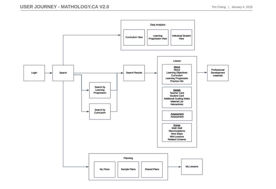
A user journey webflow was already created prior to me joining the team on this project. With this webflow, I have a good understanding what screens need to be created and a general idea how each of these screens function among each other.
How did I go about in solving this problem?
At first for the first few screens only, I was designing the most difficult screens (screens that have a lot of data and/or functionality actions) on a desktop view. The major takeaway from those few screens was figuring out how to put everything in there without making the screens look busy and keeping it clean with a lot of white space. However while this approach is achievable on a desktop view, there were a lot of issues when the web application needs to downsize to smaller devices such as the tablet or phone. One primary issue that exceeded all was the lack of spacing in the user interface. A lot of concern came about because with small device views in addition with a lot of data plus functionality, we had to cut out a lot of the user interface and features.
Even though that might be a simple solution that the stakeholders and I thought about for a quick fix, in a real world scenario, this is not very professional. The reason this was not a good idea to implement was because the customer was expecting to have those features promised and by eliminating them, the entire scope had to be changed and there could be a lot of repercussions in doing so. Such reverberation could be losing current and future customers or leaving a bad remark of the entire company resulting in bad for business.
Unfortunately with this turn of events, I had to take a step back and rethink of a better solution. The new solution was then to go for a mobile first approach instead. Even though the main platform for teachers is that they will be using the desktop to do majority of their work, the mobile first approach is to make sure it still presentable and usable for small devices. The secondary and considered to be the primary feature of going the mobile first method is that it allowed all the stakeholders to really dig deep to ask these questions among themselves:
What design/functions are really necessary to keep?
What design/functions can be combined?
What design/functions can be used in a different time and situation?
Will the design/functions change the user experience?
After answering these questions and if there were still uncertainties, as a final solution if necessary was to take it out all together. At this point if the design or functionality were to be removed, it is fair and just why it was unavoidable to be removed from the web application.
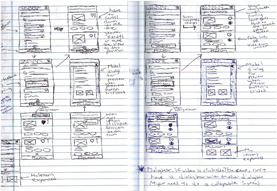
While a mobile first approach was chosen. Sketches are still necessary at this beginning state. Above screens are sketches for the search function. It is displaying the search results when a user does a keyword search.
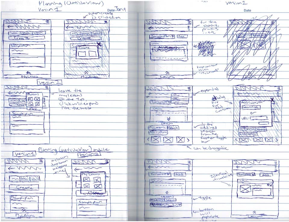
Because this web application has a lot of features. A lot of sketches were necessary. Above are screens for the planning stage. It is currently inside a plan and have functionalities for the user to add lessons to a plan either by drag or click to prompt a display to add.
The three main functions: search, lesson and plan creation require more researching and thinking to accomplish an effective user interface because these are the three main functionality that the teachers will see and use very often. How I approach with the researching for these three are that I was looking for similar functions on other websites that are effectively working and people that are accustomed to.
For the search function, my main idea was deviated from Google. Google had a bunch of tabs for filters and it is this filter idea that I have chosen to use for the search. I want the use of filters to be the main focus for allowing users to search what they need and populating the results with the filter selections that they have chosen.
For the lessons page, since I had to use a mobile first approach. It was a matter of carefully thinking of how to transition the functions that are in a bigger environment into something that can be group together that make sense for the user (Eg: a whole sub section into a single collapsible accordion). While researching I also really enjoyed the layout of the Google search and the Facebook mobile app where the user can tab through different categories. Since these two are really popular among users, I wanted to incorporate this function. However because of my experience with similar scenario on other projects, not many users enjoy a horizontal draggable tab bar since there are too many tabs to fit on portrait view for this web application. My best solution was to use a drop down menu instead to switch the screens. This solution would not only be much straight forward but it also reduces the need to add a heading to the current view thus giving up more space in an already heavy space restricted environment.
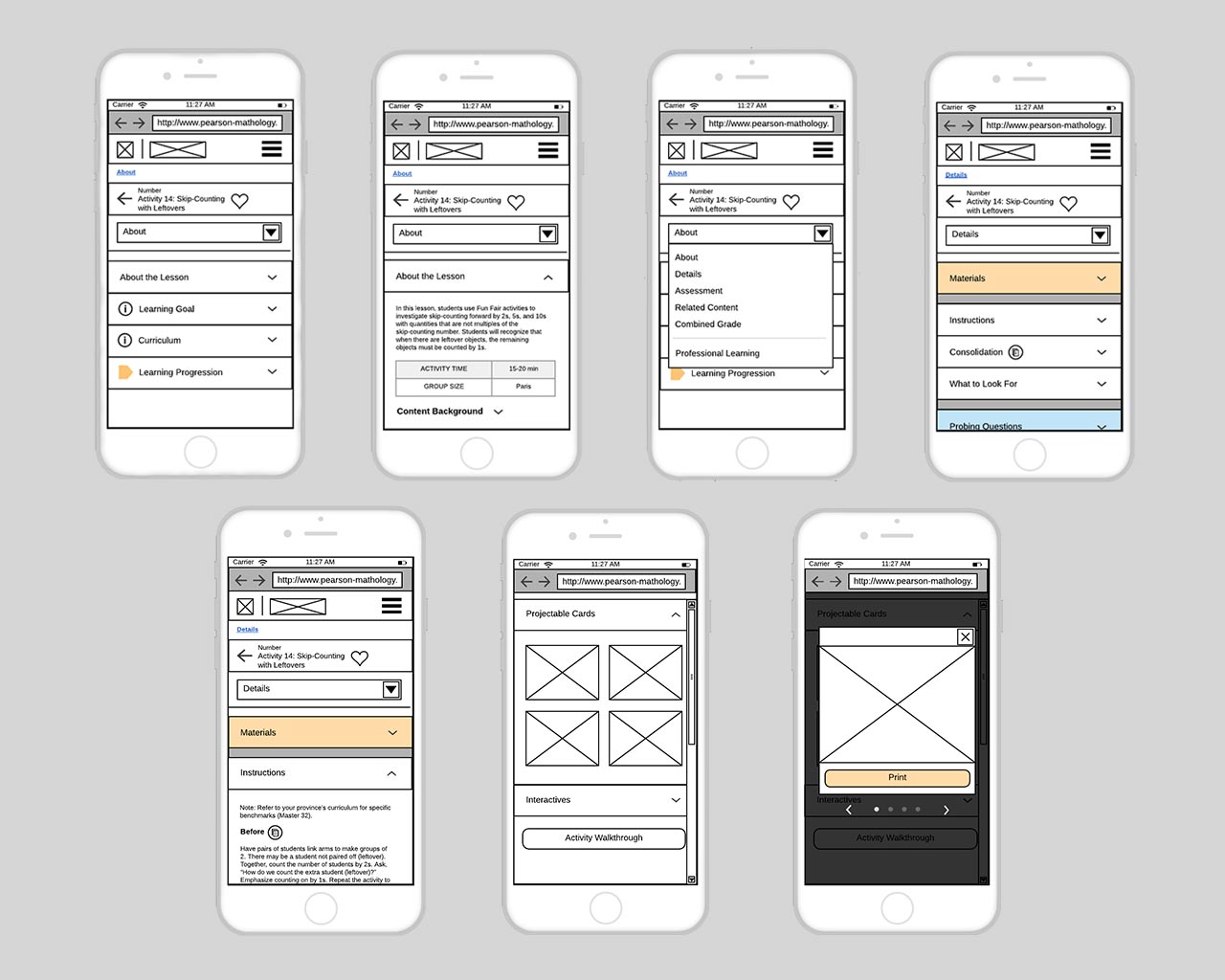
In order to speed up the process of making these pen and paper sketches, I have change the low fidelity creating medium to Lucid Chart to be able to pump out more screens at a faster rate and also cleaner ones as well. Above are mobile screens when the user is on a lesson page with many features either combined and/or hidden from the main view because they are not that important to be shown right away.
Lastly for the plan creation functionality, my research is actually from my previous knowledge of past projects I have done as freelance. The way it was designed and how the function behaves is like a Wordpress dashboard. In the image section where the admin can upload images. There is an option where the user can click the upload button or drag images directly from their desktop windows into the “drop zone” area. I want to mimic that idea but modify for this web application. Instead of having the “files” on their desktop, it is the user's favourite collected pool of lessons on the website where the teacher can click or drag which lesson into the plan. From doing all this click or drag efficiently, a plan will then be generated.
Having all these ideas collected and sketched out in one way or another, a Powerpoint presentation was later presented to show to stakeholders where all the features from a desktop will be located and placed on a small device such as a mobile phone.
“Unfortunately with this turn of events. I had to take a step back and go with a mobile first approach. Even though the main platform for teachers is that they will be using the desktop to majority of their work.”
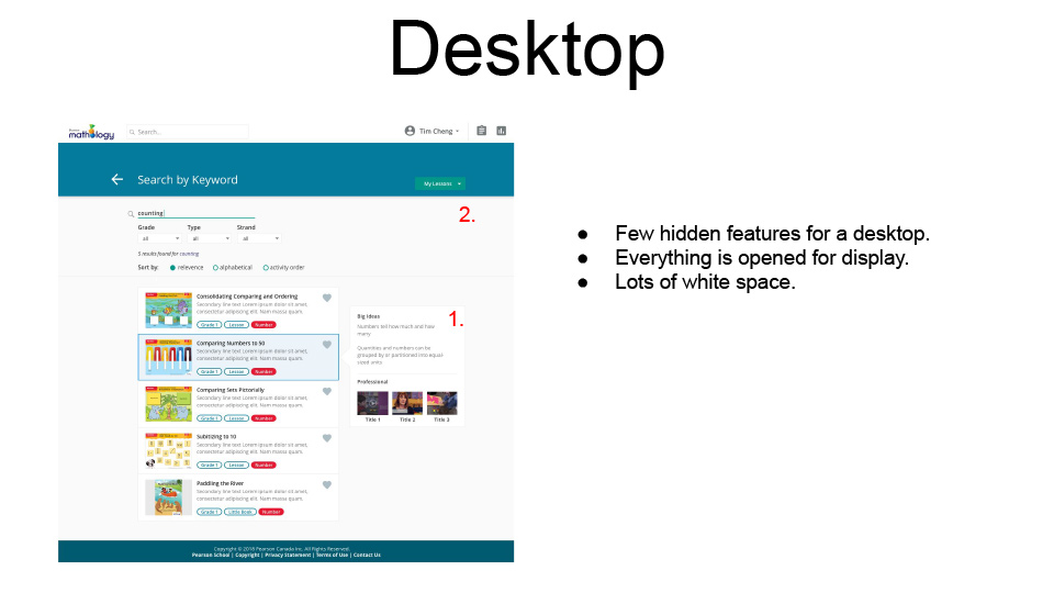
A Powerpoint presentation was presented to stakeholders from my findings via research. The desktop display which has all features available and in present view was the main issue.
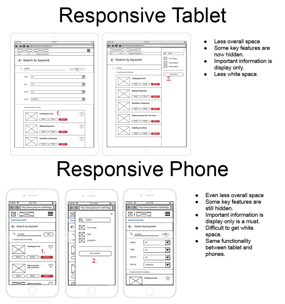
A mobile first solution was needed to explain why this approach is important and why we needed to go backwards from the smallest view to bigger views.
What steps I have used to overcome the problem?
As mentioned above, because majority of the data is collected and the user webflow was also created in the same process, it was easier to narrow down what the requirements are. Requirements such as picking specifically what are the main pages that needs to created and how they interact with each other. I have use Lucid chart and pen and paper sketches to come up with ideas of the placements for functionality quickly. After that I used Adobe XD for the high fidelity prototypes to showcase the potential look to the stakeholders and the functionalities associated with them.
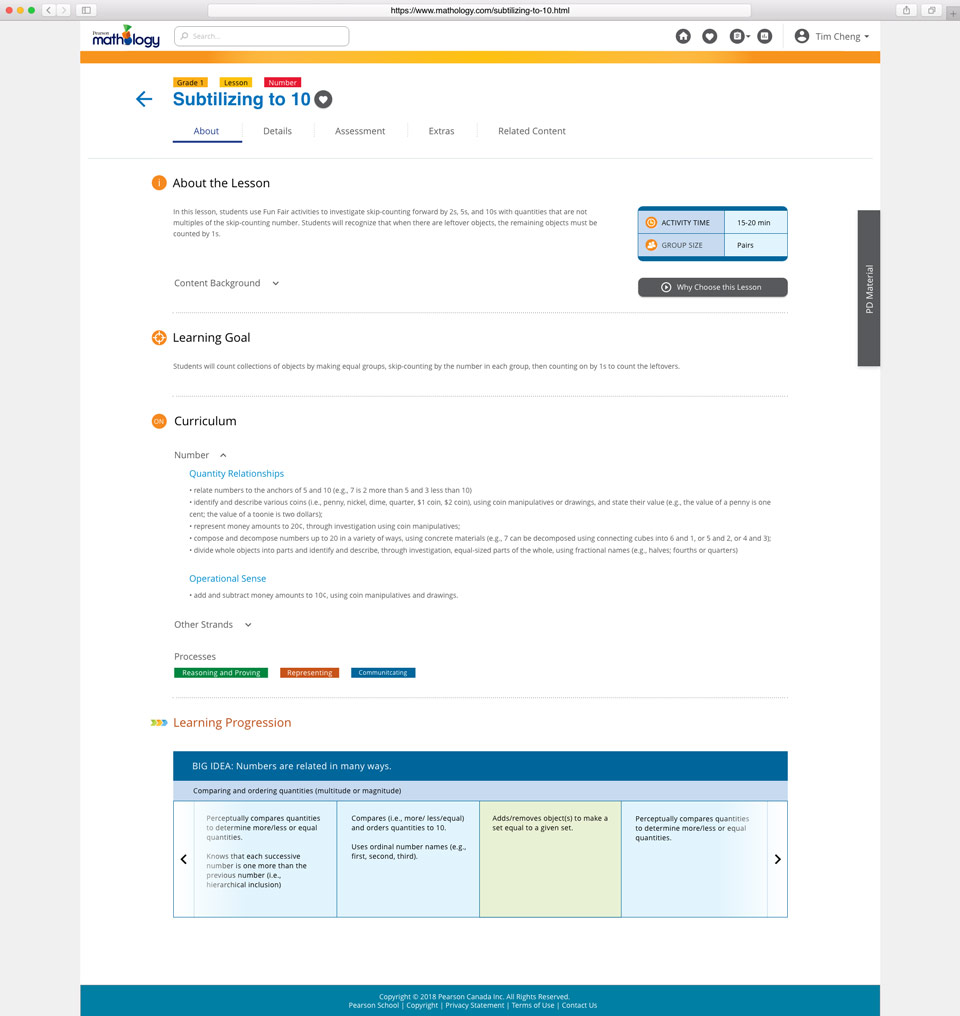
The lesson page which is the website main feature created in Adobe XD is currently showing the about page. All users when they click on a lesson is defaulted to this about page.
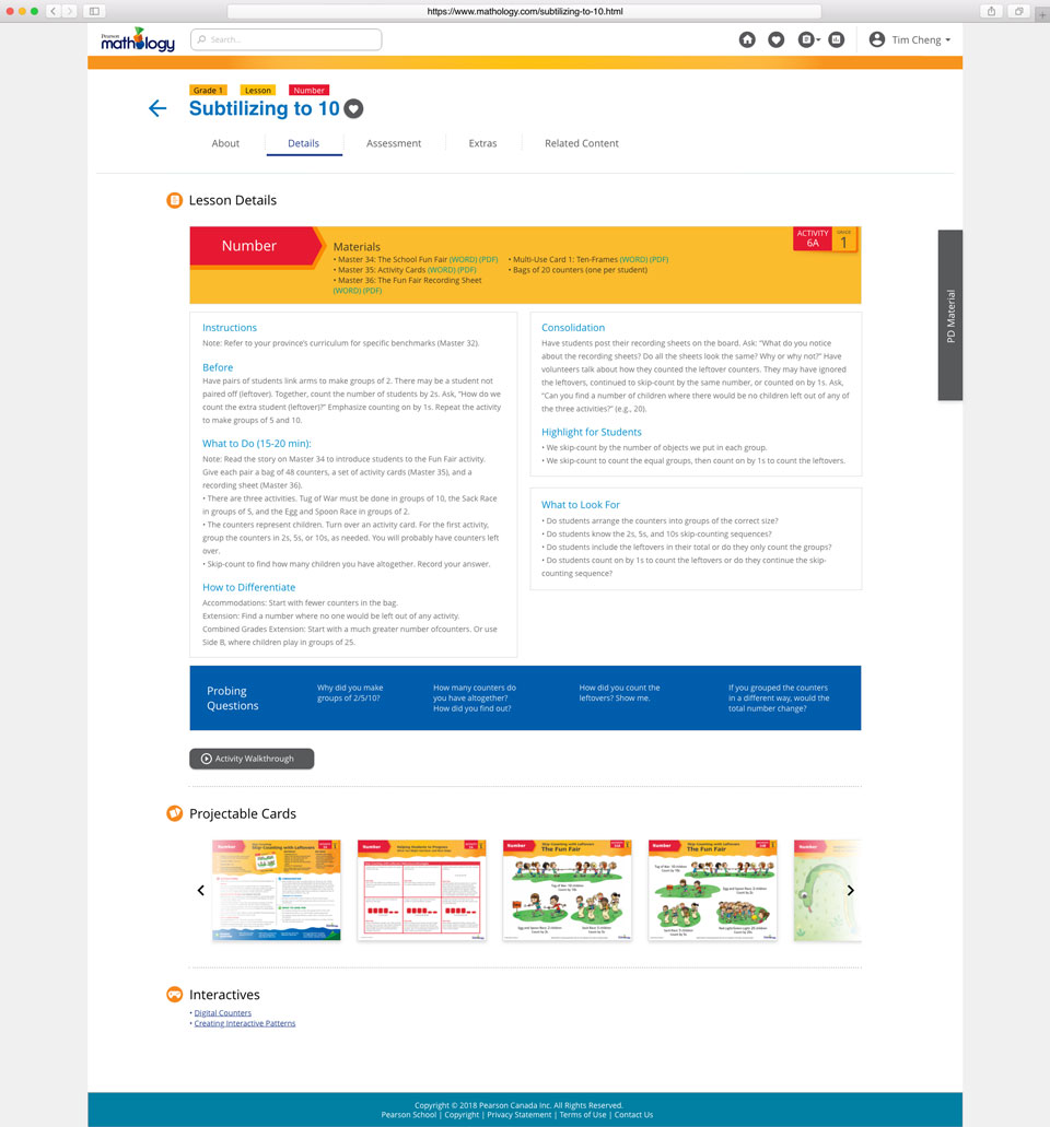
Like the low fidelity above with the mobile view and all the sub categories in a drop down menu, the lesson page has many sub sections that can be tabbed through by the user. The above image shows the details tab of this lesson.
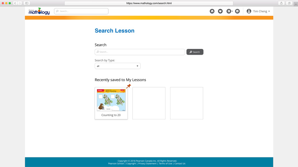
Search feature in the desktop view. When compared to the mobile low fidelity design above, the pinned lessons are hidden and only when the user clicks on at the footer bar will the 3 lessons then be showned. In this desktop view image, since there are more spacing, everything is showned to the user all at once.
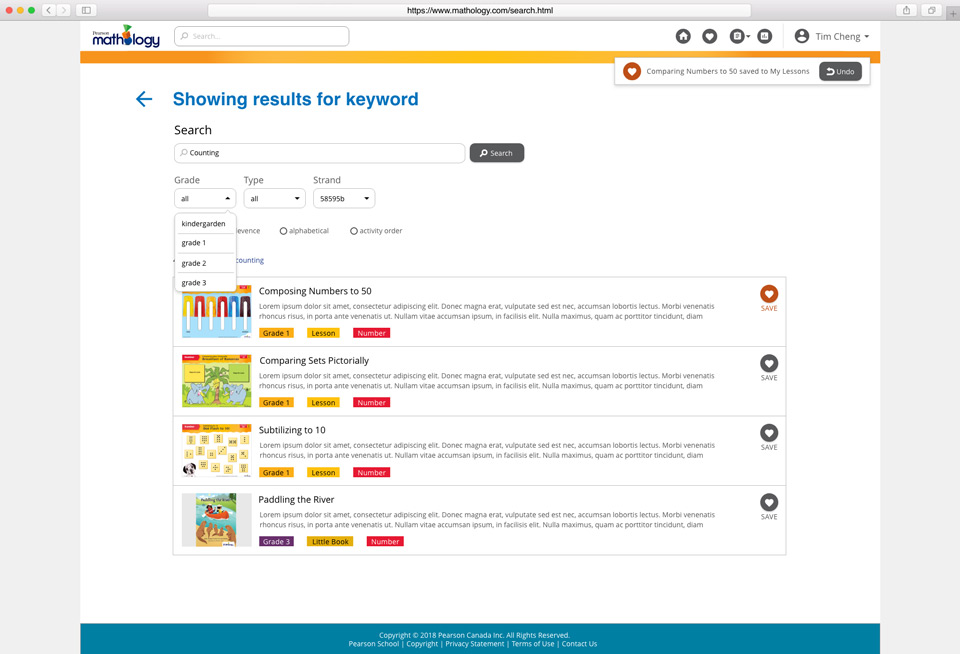
Search results when a keyword is typed in by the user. Unlike the mobile view the results have more than enough space that does not require it to go full width whereas on a mobile device, I had to design each card to make use of all the available white space as much as possible.
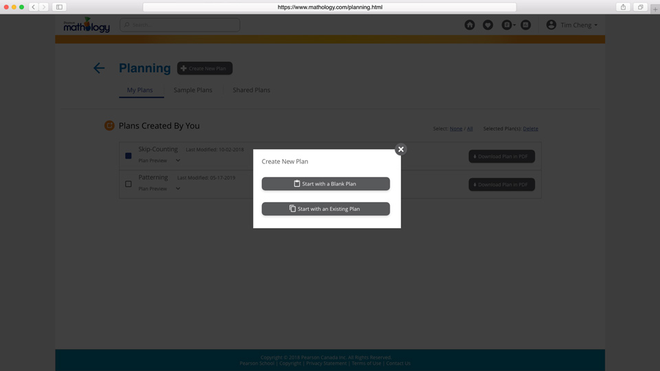
In the planning stage, the user is prompt to create a new plan or use an existing one. Since there is not a lot of content on this page, a lot of the features does not need to be hidden from view on a mobile device as demonstrated in the sketches above.
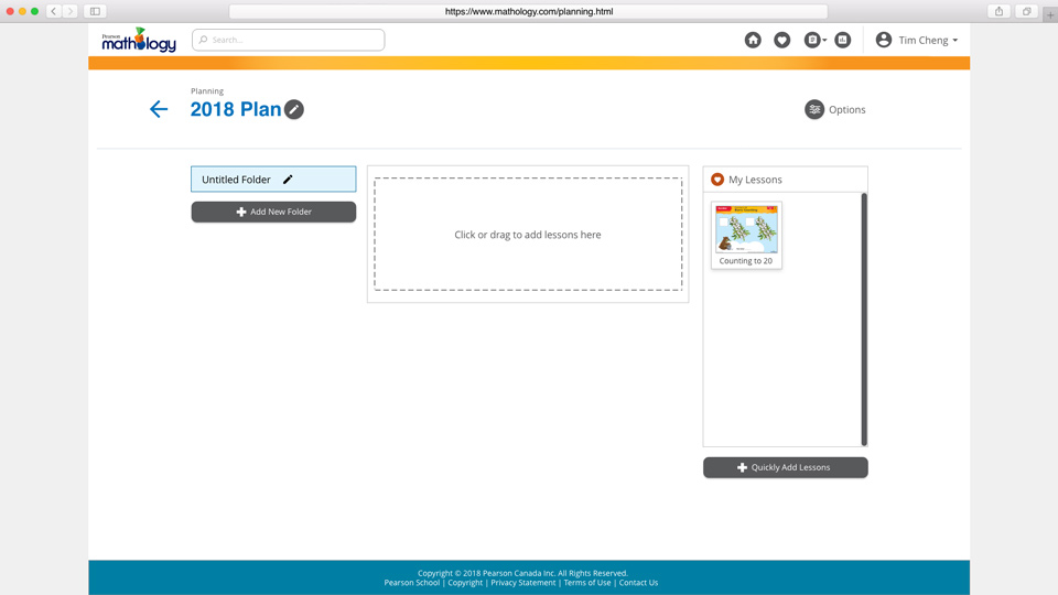
Inside a newly created plan, the user can click to add lessons to their plan or drag it from their favourite collection. This behaviour works similiarily to how a Wordpress dashboard behaves, such as uploading media content. So a similar design and functionality was used here to populate lessons within a single plan.
What I learned and what I go out of this?
Parts of the product is still being built as of today and the organization is still waiting for feedback from their usability testing. The major function such as sharing a plan is currently implemented as part of the options button with a drop down menu inside a plan. Future tests will need to be conducted if furthermore such as individual lesson inside a plan needs to have the option to share as well. Not all functionality are there on every page at the moment because the organization wanted to continuously do usability testing in partial chunks before going live with the whole web application.
Other things I got out to this project is that I learned that mobile first approach allows the designer to set the pace and look of the entire website much simpler. It is always easy to add things rather than remove things because you will never know if that function will be useful in the future or not. By taking out a functionality, the users might question why there is so much misinterpretation between what was promised and what was delivered. These decision mistakes can cause ramification leading to bad customer relationship and potential future customers.
Let's view more case studies!
Click the buttons below to go to another case study.